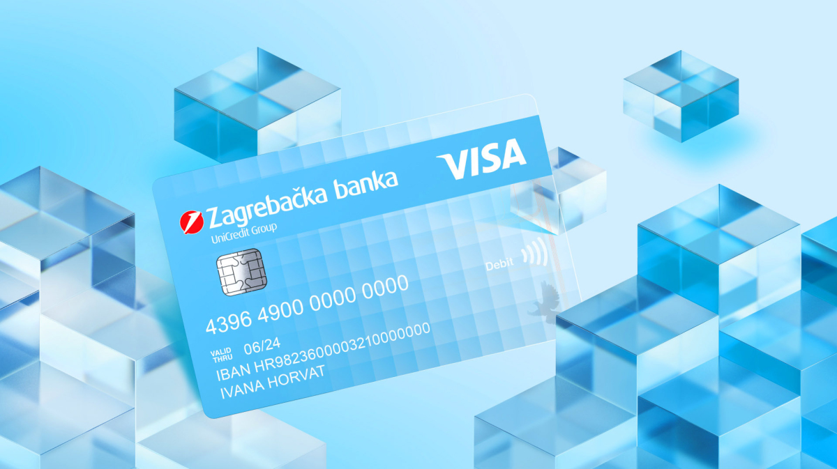
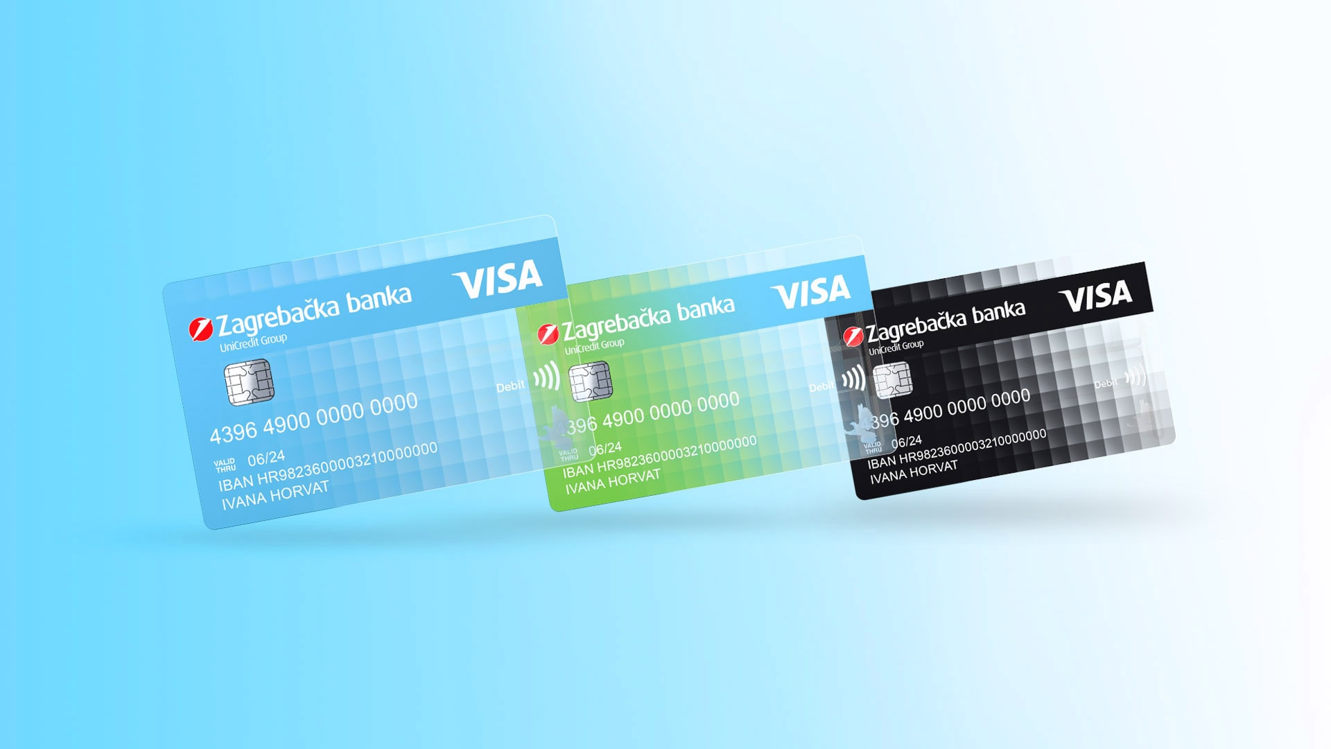
Zaba wished for a new Visa card design, and we welcomed an opportunity to present our client’s values in the form of a product that millions will use on a daily basis. The aim of this project was to make a credit card that will present Zaba as a modern, innovative, simple, digital and transparent bank — the bank of the future. In order to distinct ourselves from the competitors and make something innovative, we decided to go for a slightly different approach while still being in line with Zaba. That’s why the white-blue gradient, the most recognizable part of the bank’s visual identity, became pixelated to simply illustrate the idea of “digital”, and the color white got left out of the tone transition to achieve a partially transparent look of the card.
To emphasize the new card’s features even more vividly, we used cubes in the design-presenting animation, which symbolize the pixelated elements the card was made out of.
We also used the very type of the card as an inspiration for our new headline “A new look on paying” (lat. visus means a view, look) so that, besides literally being able to see through it, the owner of this most accepted card in the world can use it anywhere he wants to. Take a new look at the card design!
Latest News
WHAT STOOD OUT IN 2025
IVA TAKES A LOOK BACK AT THE YEAR BEHIND US
To ease back into work mode after the holidays, here’s an interview in which our Iva talks about the successes and challenges of the past year, navigating the sea of AI slop, the impact of cocoa prices on our brainstorming sessions, and her favorite projects. Thanks, Advertiser Serbia <3
[Read more]TAKE A LOOK
NEW TVC FOR JGL
Dry and irritated eyes need the kind of relief brought by the new Vizol S Hydro Lipid Balance eye drops, and those drops needed an ad to show that very relief in action. The TVC continues the “Believe your own eyes” communication platform we created for JGL.
[Read more]