What do you get when you cross a landscape architect, a few bushes, cool typography and onomatopoeia? If you're really eager to find out, scroll down and see how we have created a visual identity for a studio specialized in open space design and planning.
OPOPEN FOR BUSINESS
Although landscape architecture isn’t all that common in Croatia, the future of this industry seems rather green thanks to enthusiastic experts with a vision.
Our vision while undertaking any intervention in open space is to treat everything we might find there with more care and consideration than has been the practice for the last 20 years. Moderate, appropriate and sustainable. - Željko Radišić, CEO
OPERATION: VISUAL IDENTITY
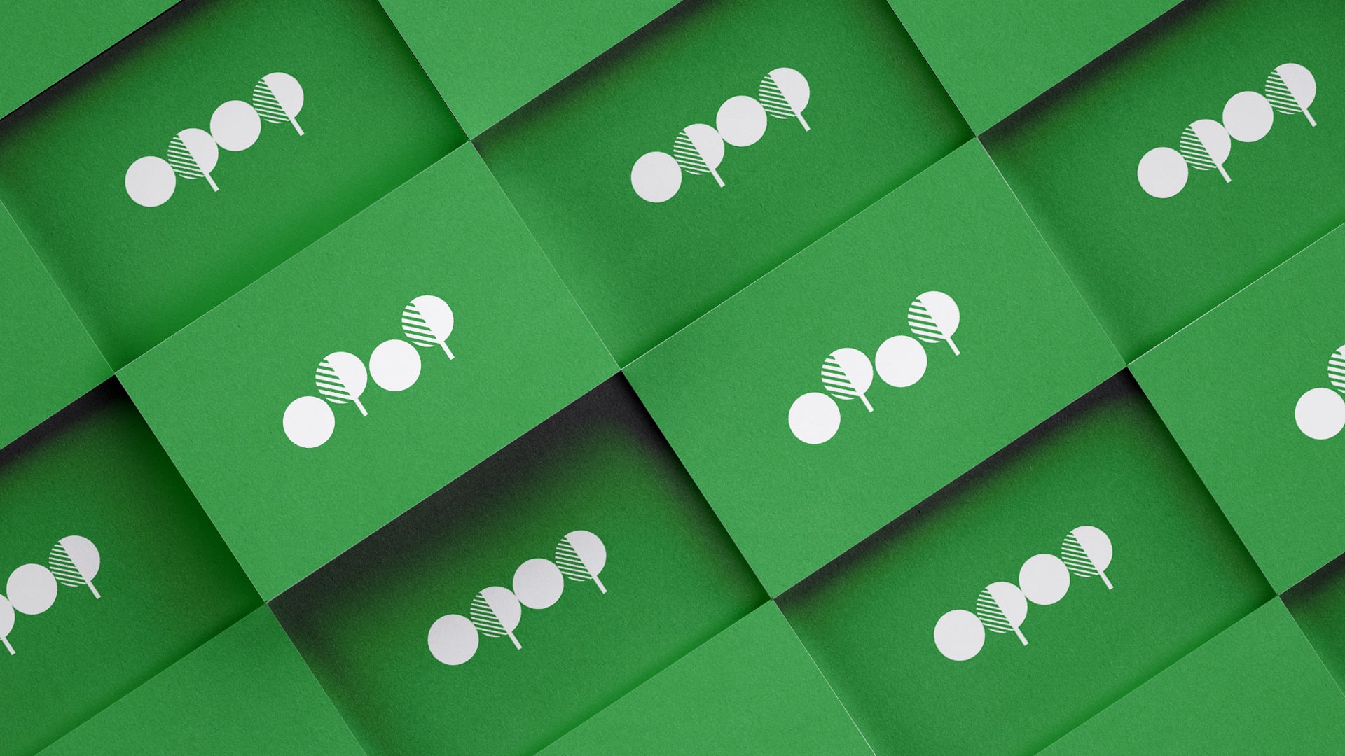
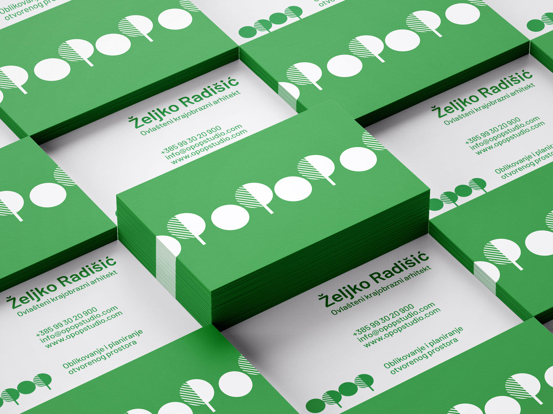
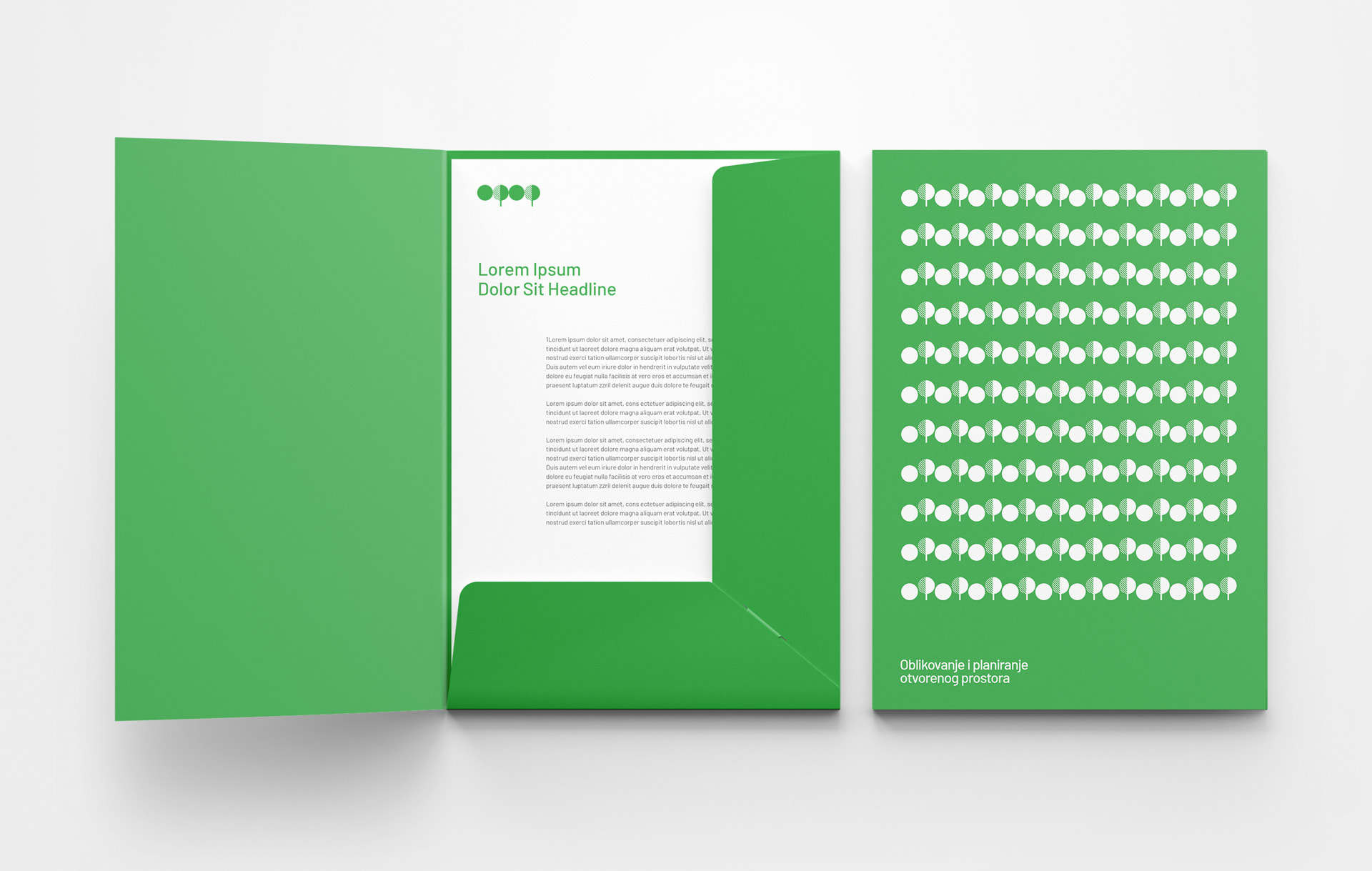
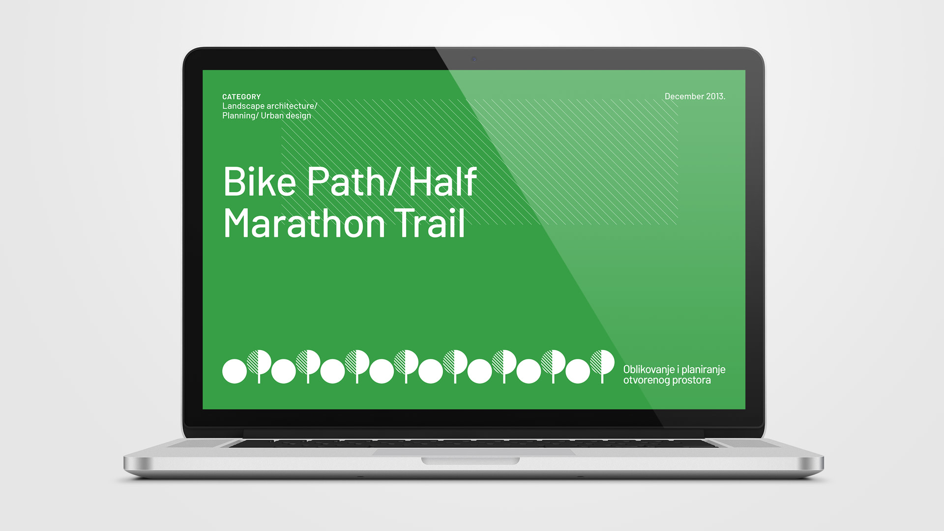
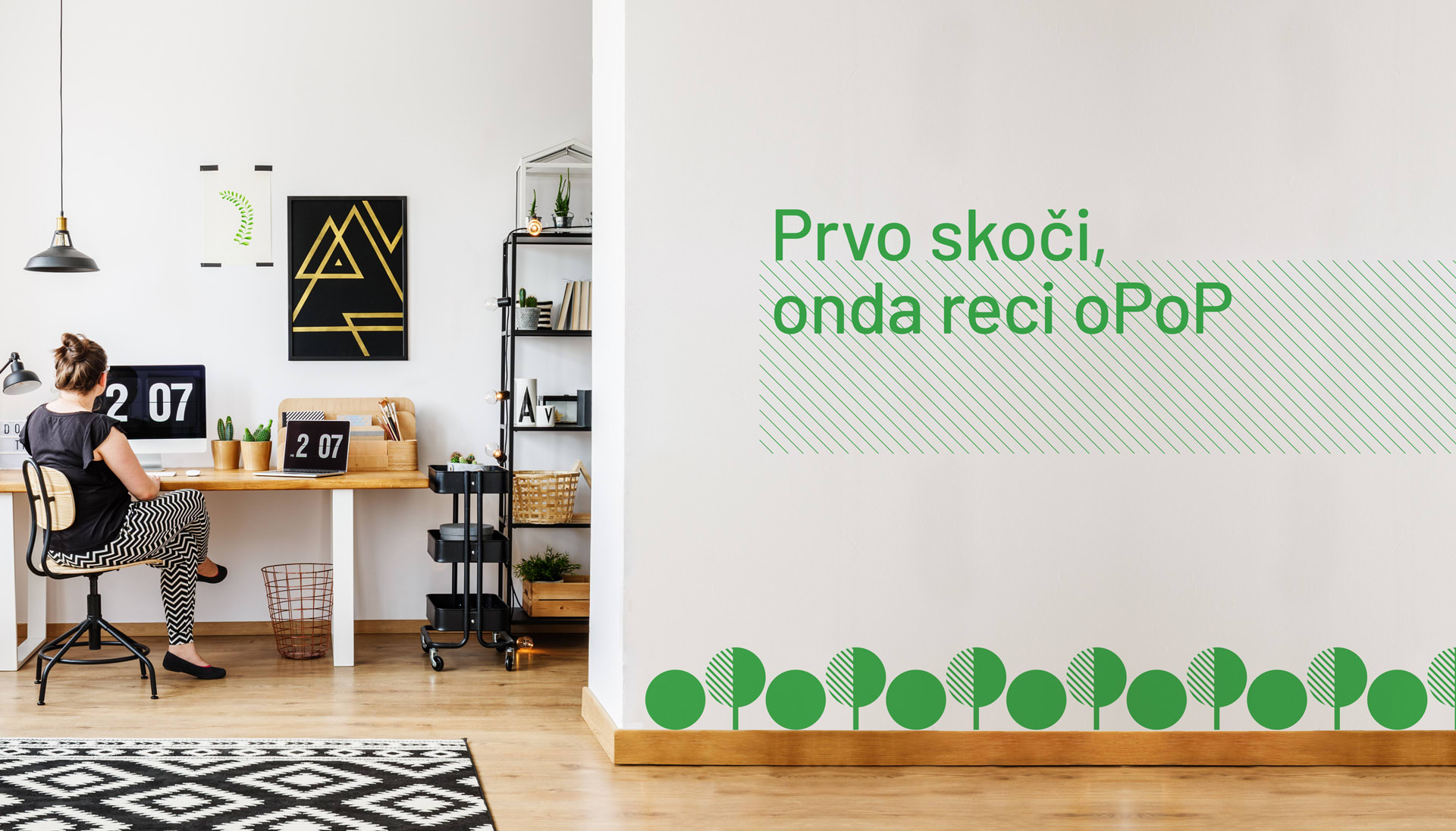
Given the descriptor of the studio “Open space design and planning” (in Croatian “Oblikovanje i planiranje otvorenog prostora” - or shorter oPoP), it didn’t take long to look at the letters and recognize a tree and a shrub, the basic elements of landscaping. And on top of that, the movement between the letters o P o P underlined the playfulness of the brand name.
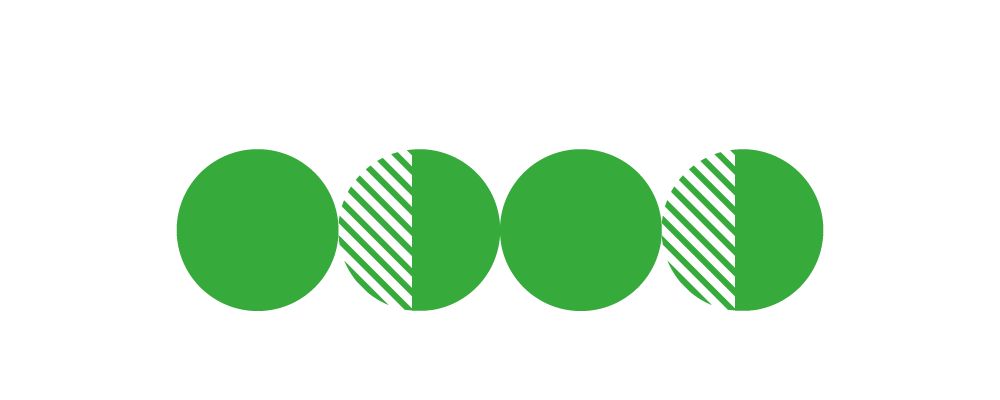
Once you become familiar with the principle of the logo and the similarity of horticultural elements and letters (o P o P), you can type out the logo in any font in your daily correspondence. - copywriter, wannabe designer
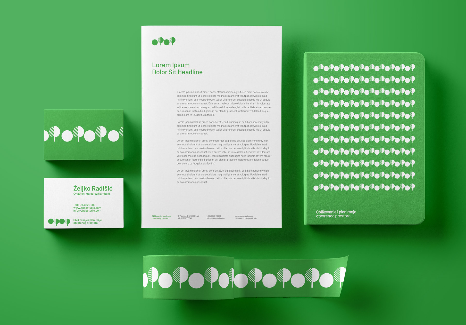
That’s how we came up with the logo - the logo also representing the typography and the illustration elaborated throughout the visual identity. We also wanted to stick to the architectural precision and the creative spirit, so we applied the minimalist flat design to all offline and online materials.
Credits
SEÑOR
Vanja Blumenšajn ~ Very Creative Director, Designer | Tomislav Fabijanić ~ Designer | Danijela Maričević ~ Account Director
OPOP
Željko Radišić ~ Certified Landscape Architect & CEO

