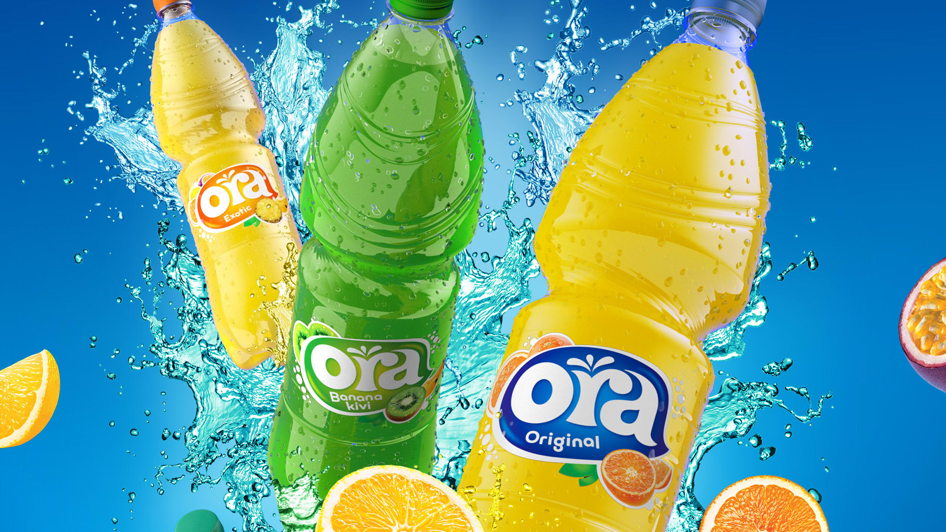
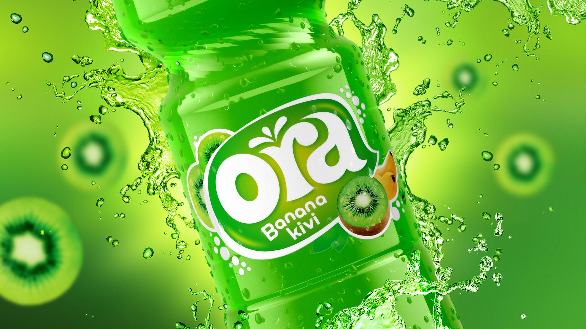
Ora has the same status in Slovenia as Vegeta, Cedevita or Franck have in Croatia – a legendary brand that consumers nostalgically associate with positive emotions. Redesigning such products can be tricky because it can lead to resistance from the consumers.

REFRESHED DESIGN
The most important thing for sparkling drinks is to leave a fresh impression, not only with its messaging but also with the packaging design. Since they are products that are often bought impulsively, the packaging should be attractive and draw (thirsty) looks. With the new shape of the label and the logo’s juicy font we achieved exactly that – making anyone who sees the new design wish for a few loud and fresh gulps of Ora.


Credits
Señor
Vanja Blumenšajn ~ Very Creative Director | Vinko Čuljak ~ Art Director | Iva Kaligarić ~ Strategic Director | Irena Lešković ~ Project Lead
Ora
Matevž Zver ~ Brand Manager