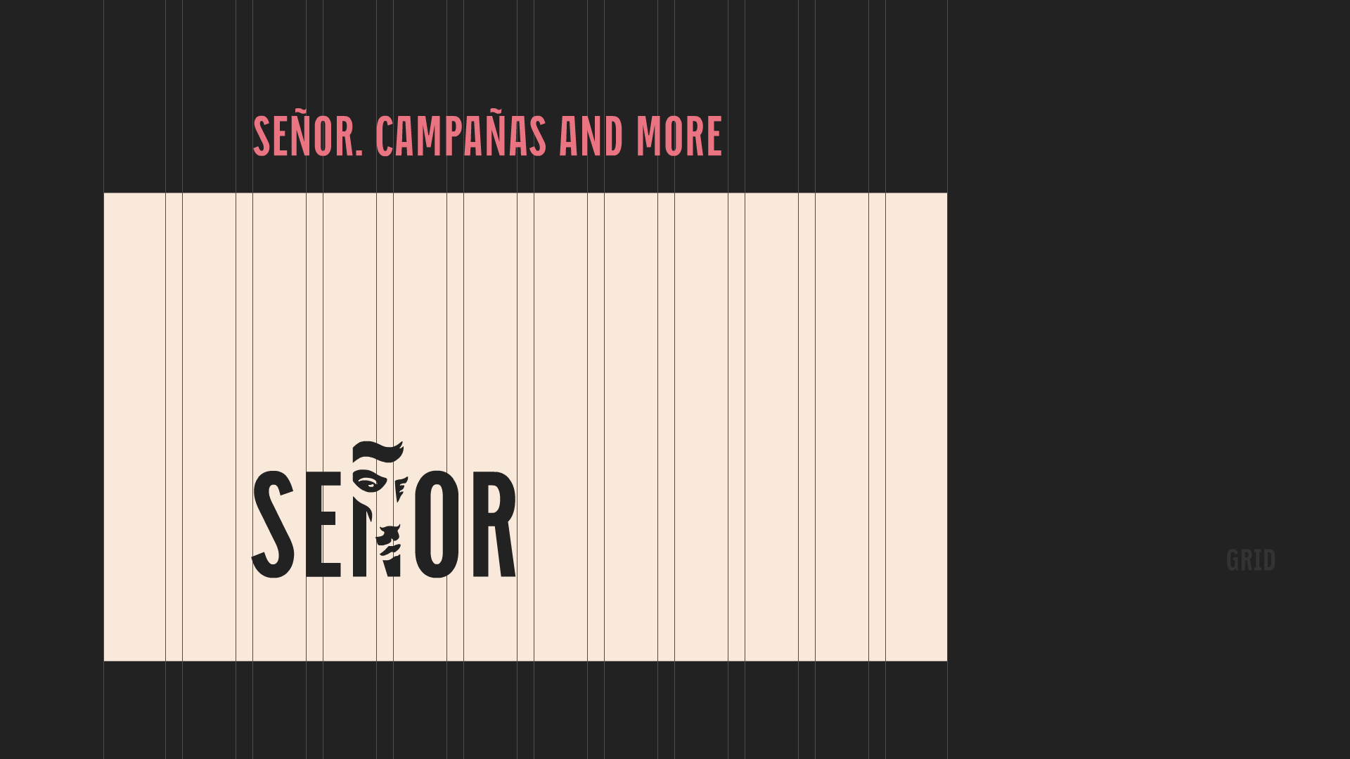
Señor has come a long way since the initial launch of the quickly stitched together senor.hr so we’ve decided to award him with a proper website for his fifth birthday. And once we decided to take on a mega-project like this, besides wanting to implement every little thing a website like this should have, we’ve come acquainted with a well-known fact that a project like this naturally keeps “dropping” on the list of priorities - so the five-month deadline easily becomes ten. And not without reason, because there was always something to do; we decided to make our own site architecture, design and all of the content. In this meta case study we’ll try to show you how we made the best agency website in the region (and beyond!) - you let us know if we’ve succeeded in this mission.
WHO SAYS THIS IS NOT OUR DOMAIN?
We approached the website like any other project: first we researched our competition. After the analysis, we defined the audience we wanted to communicate to and consequently the main purpose of making the website. We detected two main targets:
1. potential clients
2. potential colleagues (not excluding the creative industry in which we actively take part in).
So, it was clear that we wanted to present ourselves to an audience that doesn’t know (enough) about Señor, but would be willing to click (with us). If we don’t want to talk about ourselves, and we don’t, it was vital that we present our most significant projects and let them do the talking. This crucial decision laid the foundations of our website architecture.
CONTENT WITH THE CONTENT
The content was divided into roughly three groups, by order of importance: WORK (our most significant projects), AWARDS (proof of success and a visible competitive advantage on a crowded market) and OTHER STUFF (news, webshop, blog…) We decided to focus most of our attention on presenting our work, so that we could convey the thinking behind the project, show the most important materials, reveal what happened behind the scenes (statements of people involved) and show the results. In short, to present everything that was necessary for you to gain some insight into our process. This seemed particularly important to us; we believe that those who recognize our principles and feel a professional affinity for working this way will have an easier time deciding to team up with us, spare us the exhausting nuisance of pitching and maybe join us in our mission to save advertising.
Isn’t this a little too ambitious? - Zoran Šteković, Shape
I HAVE INVISION
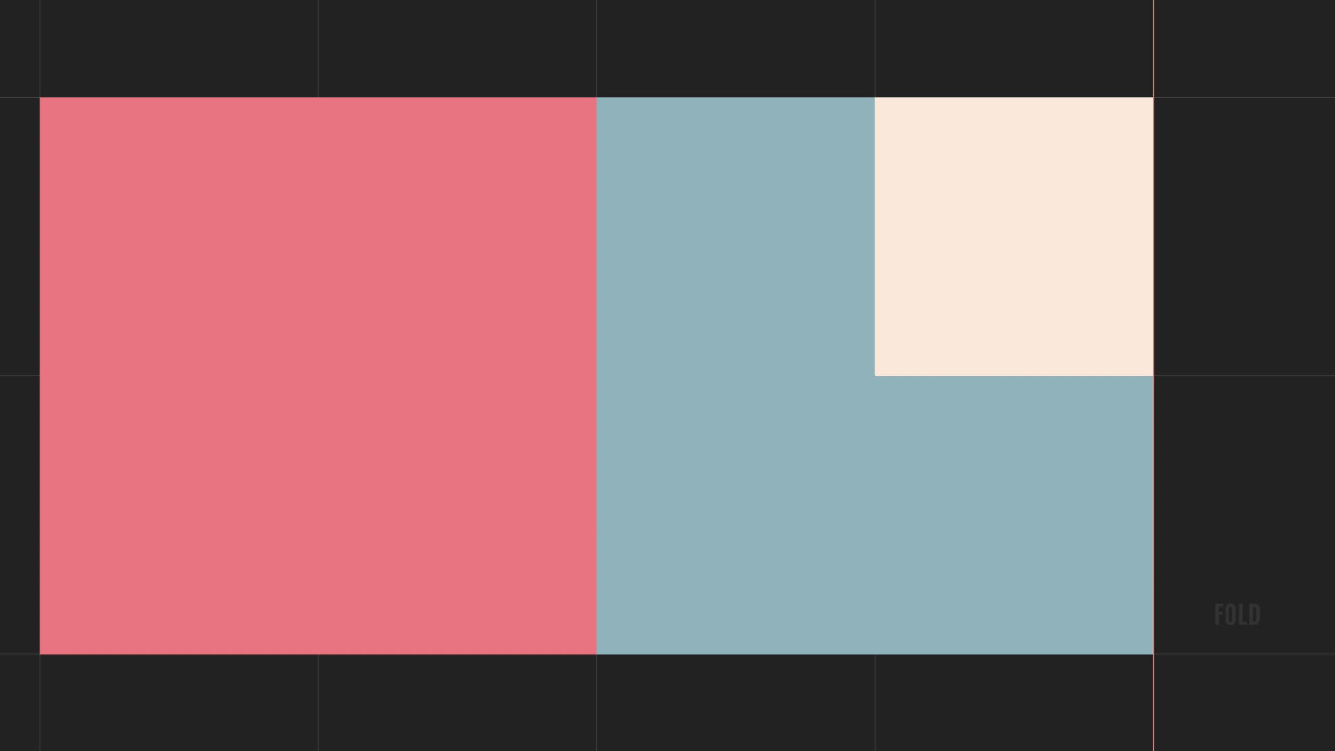
Usability is key. We know how easy it is to lose concentration or stop reading. That’s why we’ve tested every detail in order to retain the interest of our audience. The home page offers the visitors an insightful overview of the most important agency features. It consists of folds of eight modules, divided into combinations of 1, 2 and 4 connected modules, providing three different sizes, emphasizing three levels of importance. These interchangeable modules contain the most important projects, awards and news. This way even those who don’t have time can easily get a glimpse of who we are and what we do. Of course, every click leads the visitor to get more acquainted with a particular category.
At one point, there was a serious debate on whether we should have a mobile version of the site. We worked too hard to have someone look at our projects on a 2x2 screen. In the end, we gave in to the pressure (millennials!), but we would love if you'd experience the website's desktop version. The mobile is for our address and contact!
To keep the site alive and kicking, we’ve decided to keep the news in twitter format and our blog - a polyvalent, multi-medial, multi-disciplinary online space which leaves us with enough room for analysis, opinions, commentaries, open letters, critiques and all other forms that we feel like sharing with you.
GET A LOAD OF THIS!
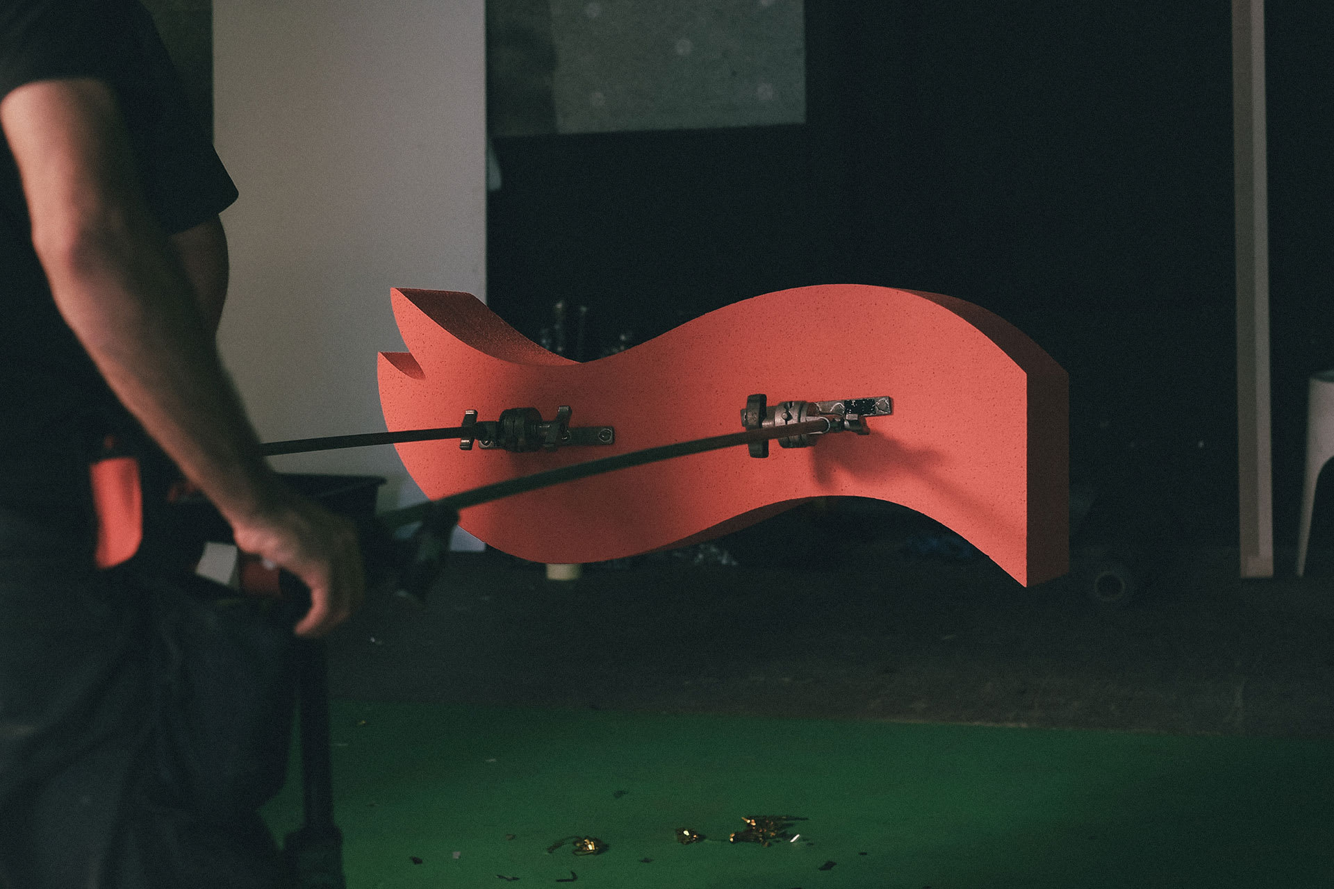
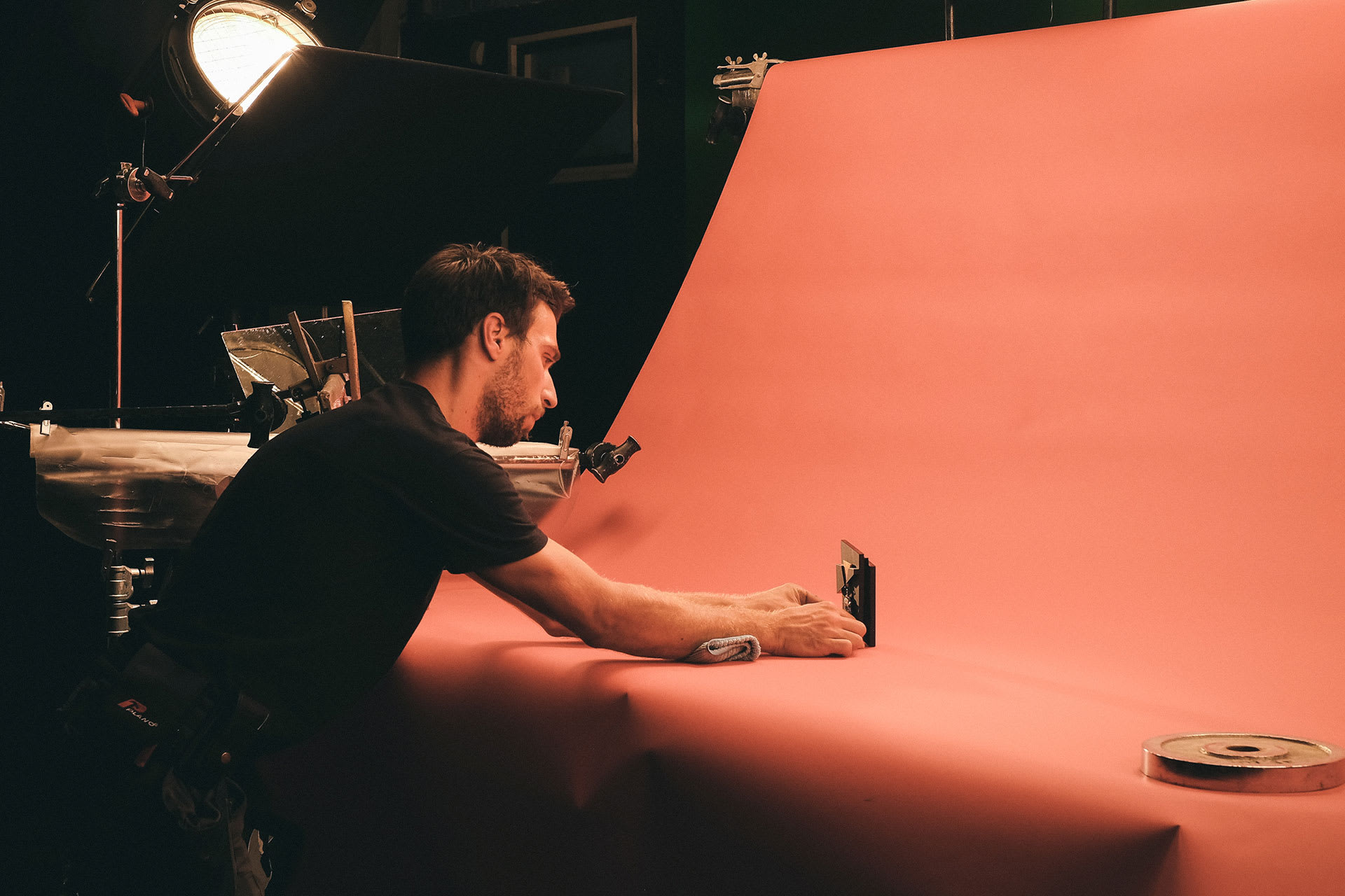
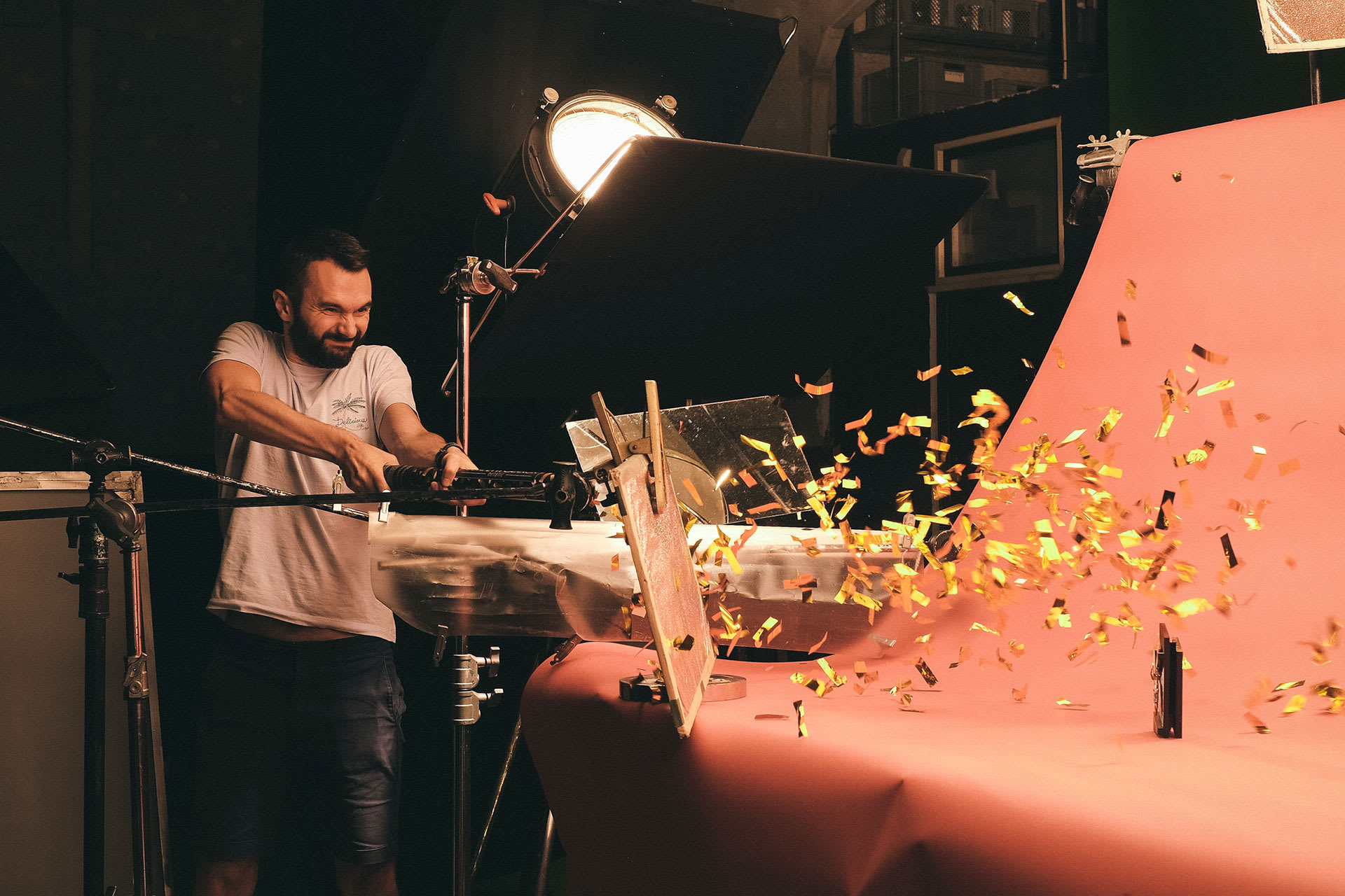
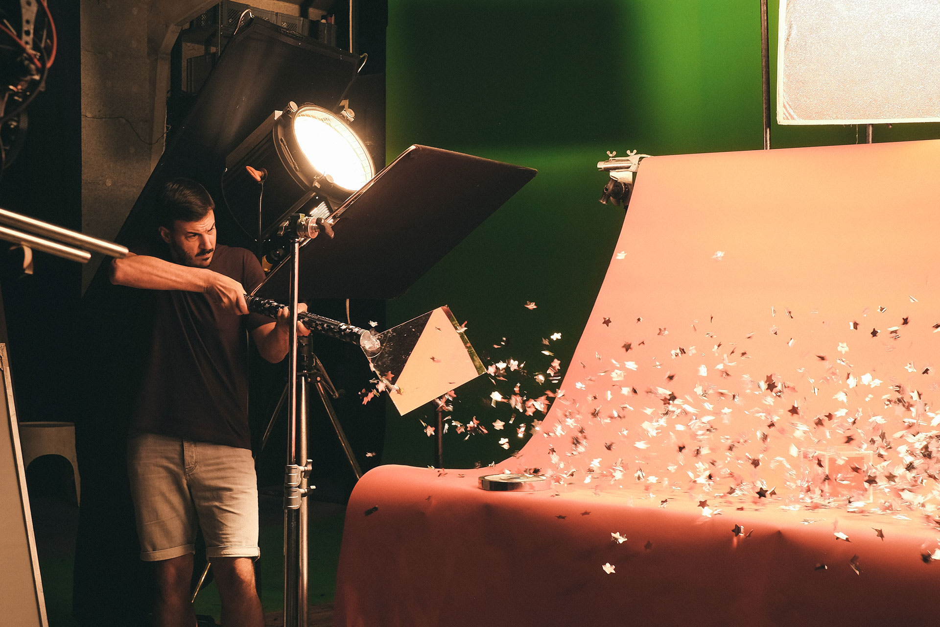
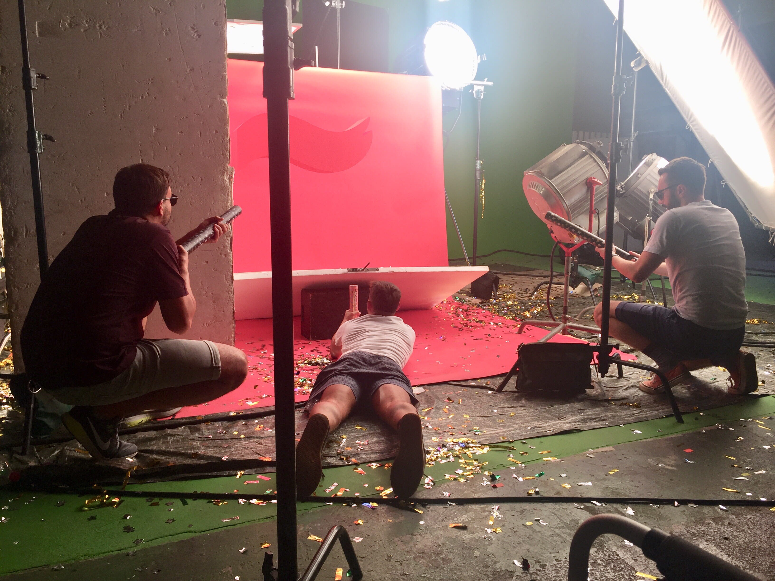
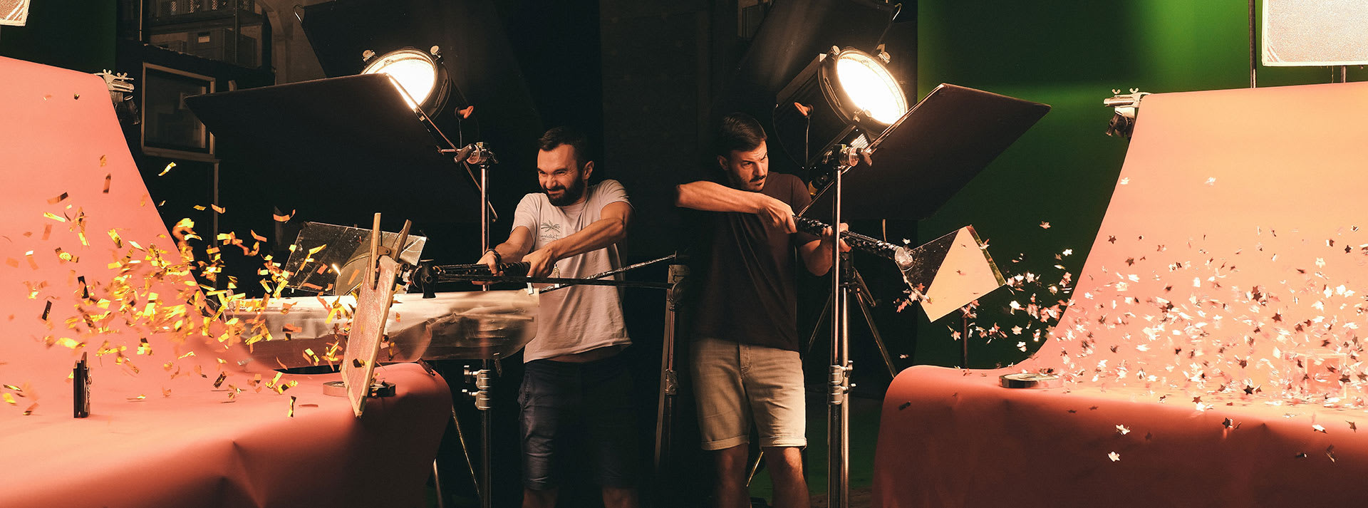
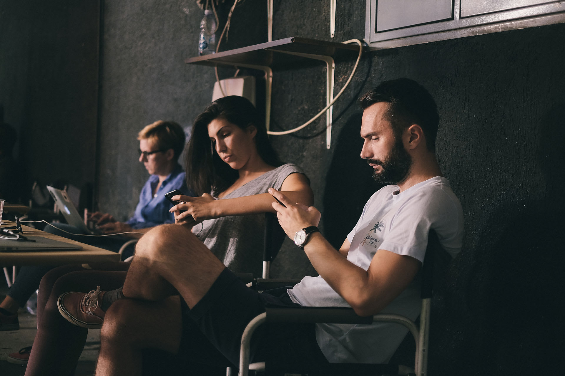
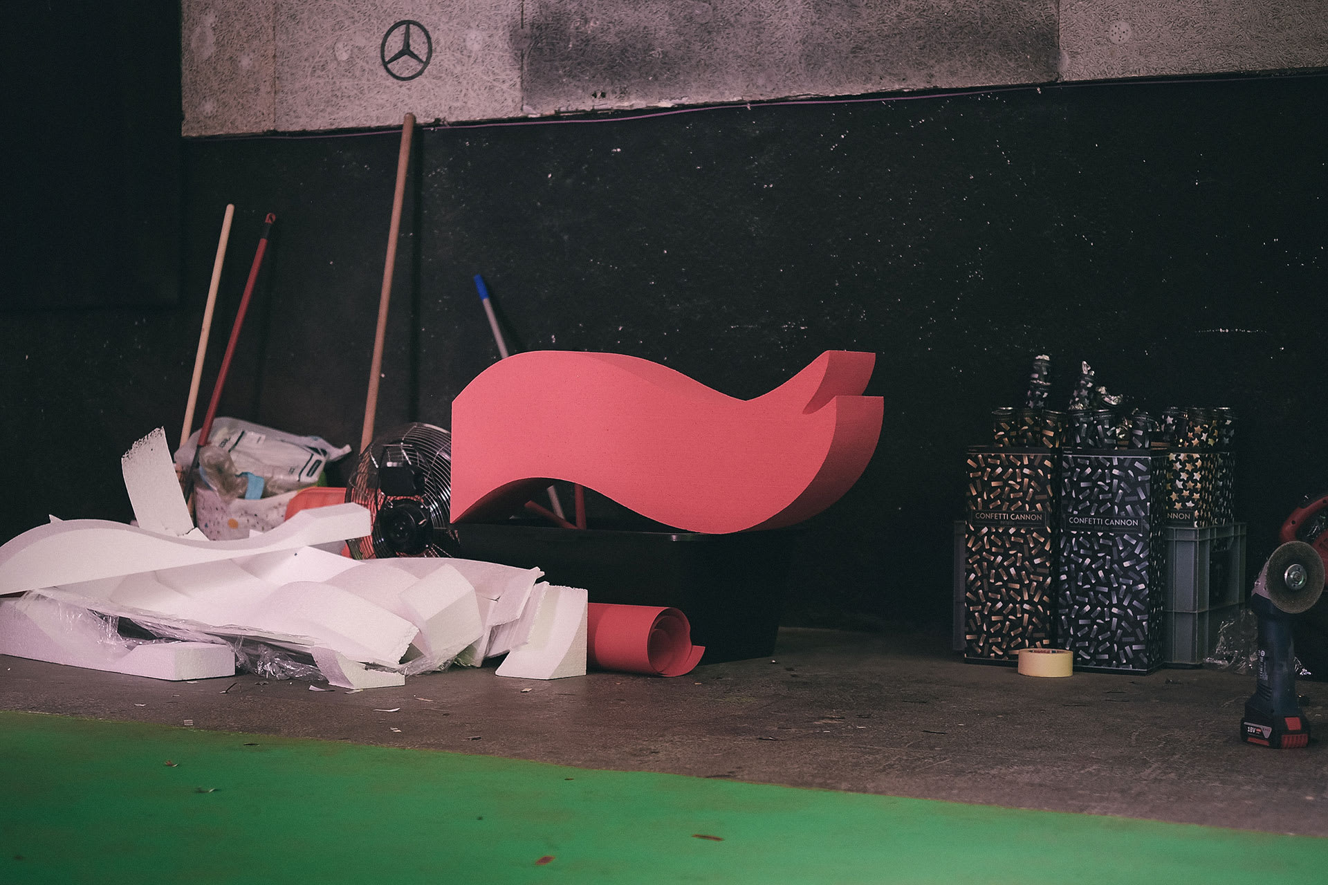
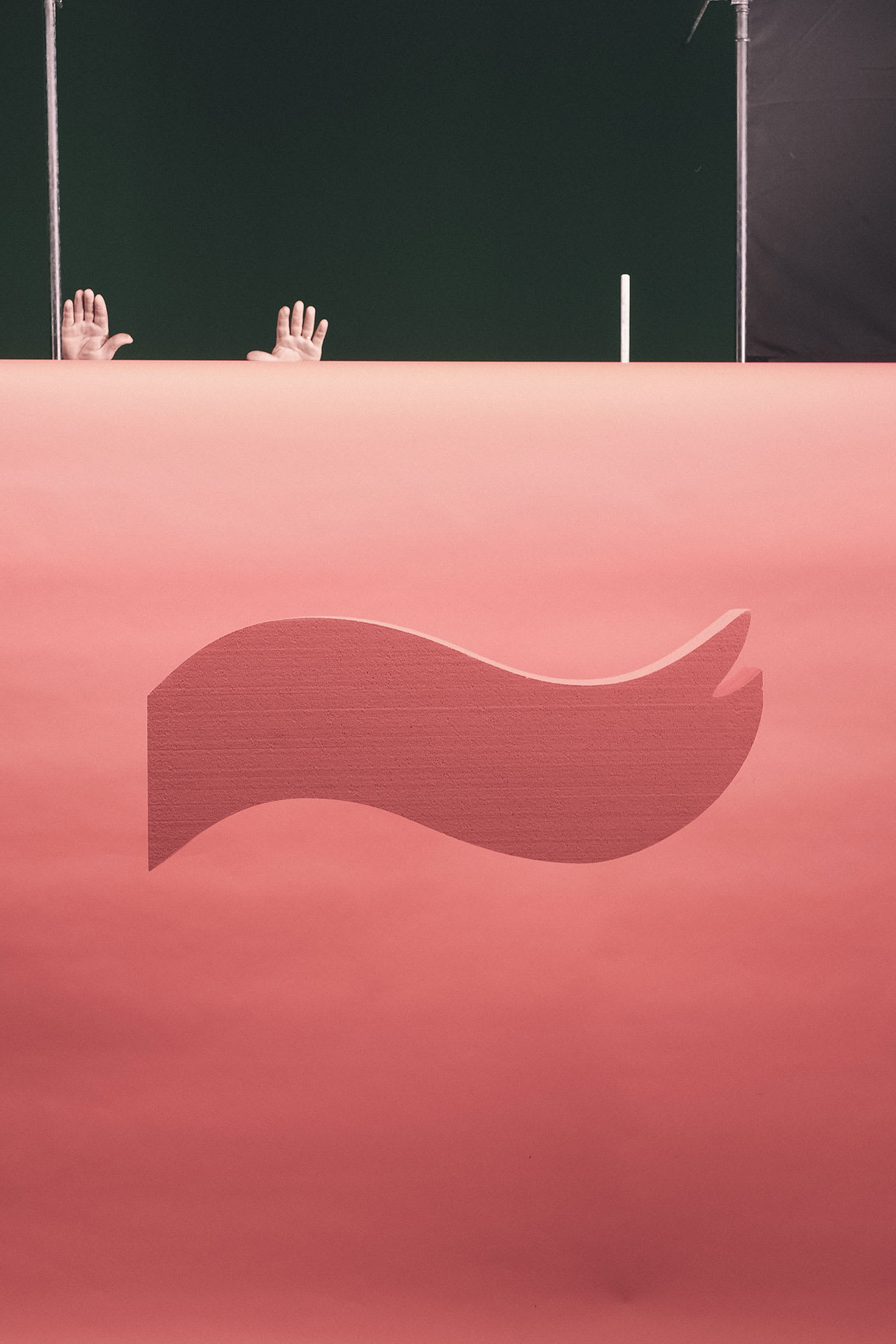
It isn’t often that in a span of a couple of years an agency wins awards for the best agency in the region, the best campaign of the year, the best packaging in Croatia and the region, the best billboard and a Grand Prix for the best digital campaign. That’s our comparative advantage, something that cannot be claimed by numerous other agencies and studios whose websites proudly purport that they are „happy, playful and the most creative in the country.” But how do you show these things in an unpretentious (and interesting!) way? From the start, we had an idea about video content that could represent our visual identity. Typically for us, a couple of brainstormings later, this idea escalated into renting a high-speed camera, a huge studio, a bunch of confetti, pedigree cats and a heat stroke from all the lighting (and the production fee).
THE END OF THE INTERNET
We close this reading session about Señor’s website on Señor’s website, hoping that the amount of puns (have you stumbled upon our mini Read more campaign?) and everything else we’ve written about didn’t stand in the way of our main goal: you getting to know our work and our modus operandi. May they inspire you to push your own limits or contact us so together we can create some new pages on this domain. But before you do, click-click; because, much like in everything else, we’ve set ambitious goals for our website traffic.
Credits
Lead
Vanja Blumenšajn ~ Very Creative Director | Nina Trumbić - Project Manager | Miro Čavar ~ UX/UI designer
Content - Text
Jurica Ćorluka | Luka Pervan | Zvonimira Milevčić
Content - Design
Miro Čavar | Damir Mazinjanin | Mišel Kovačić | Tomislav Fabijanić | Alen Lipuš
Content - Header and awards videos
Señor ~ Direction | Mario Topić ~ DOP | Ana Šepić Šolaja ~ Producer (Centralna jedinica) | Mario Pulek (Ater) | Mirela Budimić - Colorist (Ater) | Marin Balaić ~ Video guru
Web production
Shape
Support
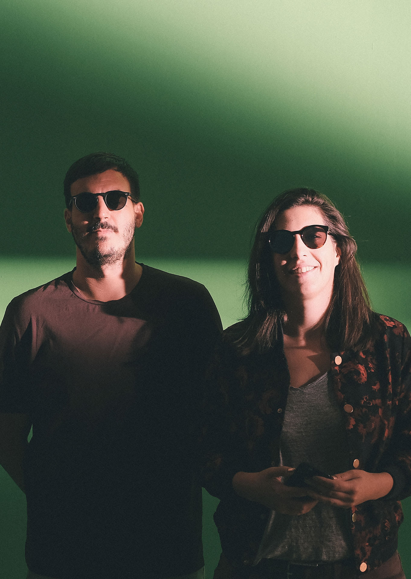
Anja Mutić ~ Translator | Marko Belić ~ Content manager | Egon Marić ~ Content manager | Stipe Bačić | Danijela Maričević | Anamarija Vuić | Iva Kaligarić | Damir Žižić ~ Photographer | Boris Miletić ~ Photographer