

Doctors make the worst patients - or so the saying goes. We wouldn’t be true to ourselves if we didn’t, stubbornly and against the grain, decide to change this tedious practice.

THE LORD IS OUR SAVIOUR
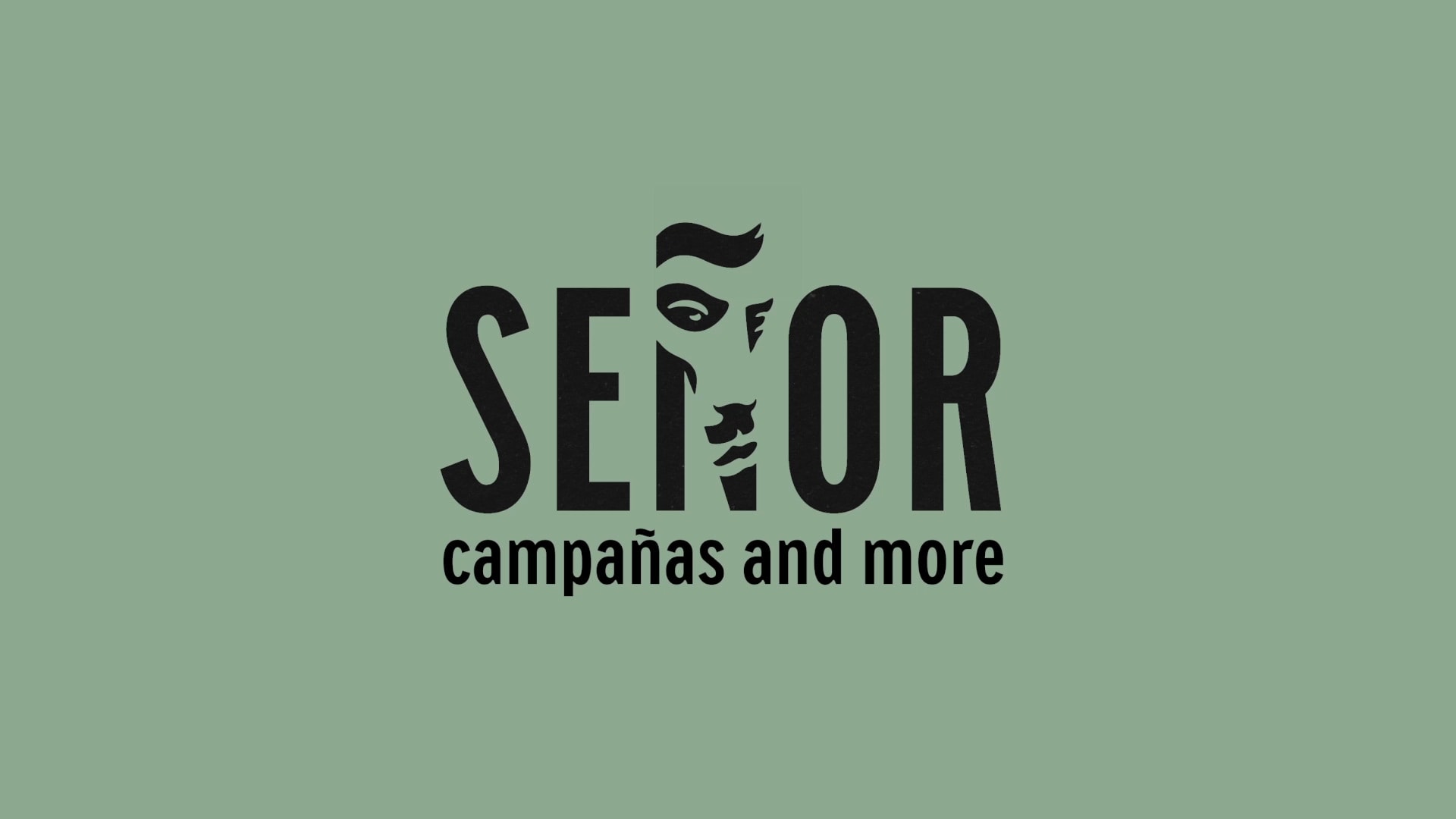
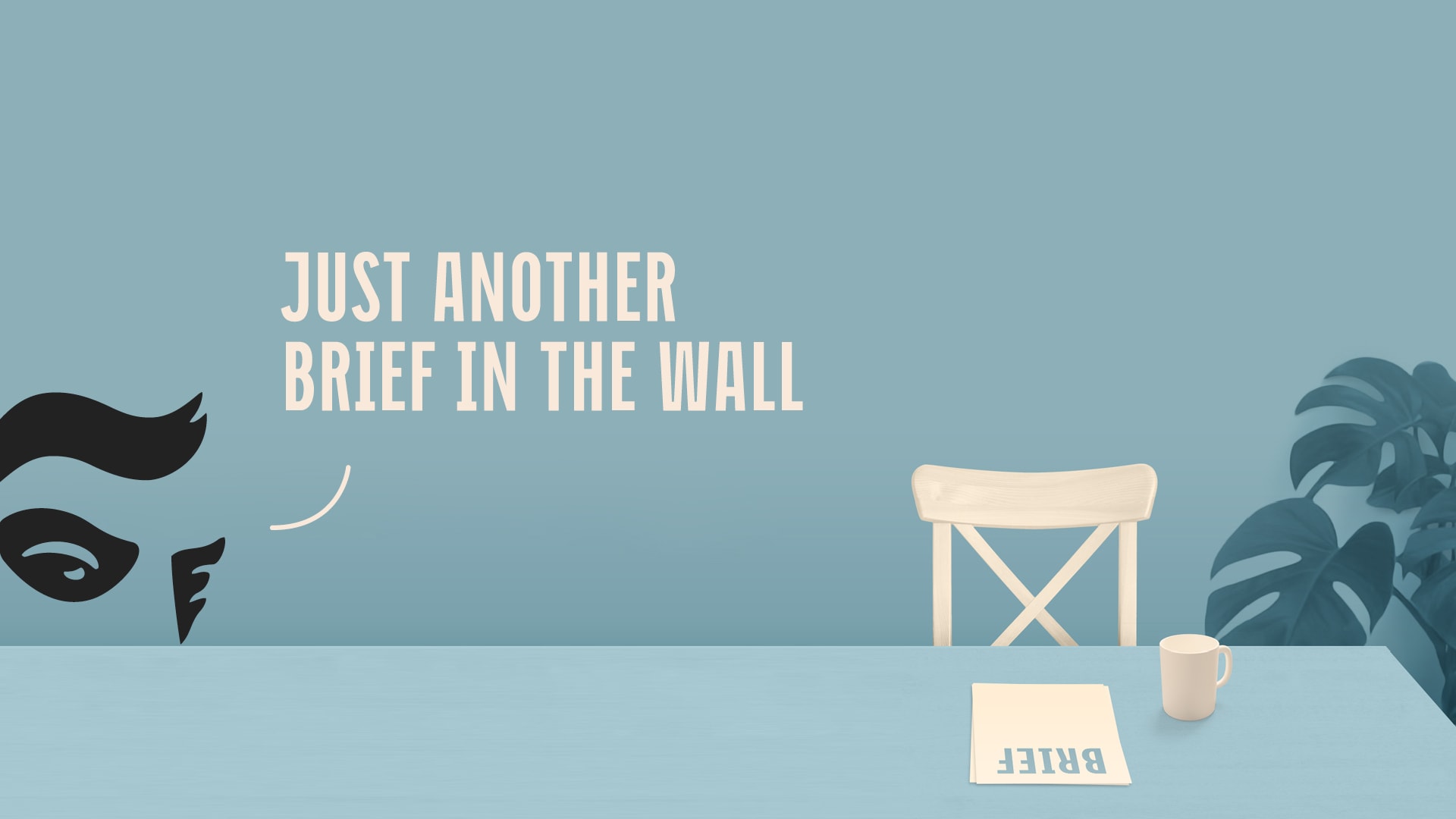
The names of global creative agencies mostly fall into three categories: 1. the names of the founders, for example Leo Burnett, Saatchi&Saatchi… but Kaligarić-Blumenšajn didn’t have much of a ring to it, 2. the description of the work they do – Idea, Communication Laboratory… and 3. the creative ones like Mother and StrawberryFrog which took the liberty to sound imaginative and find the significance that gives them the desired meaning. And so in the midst of an economic recession and a pretty depressive situation on the agency market, Señor was born – the savior who will bring dignity back to the creative scene. Plus, it sounds sexy!
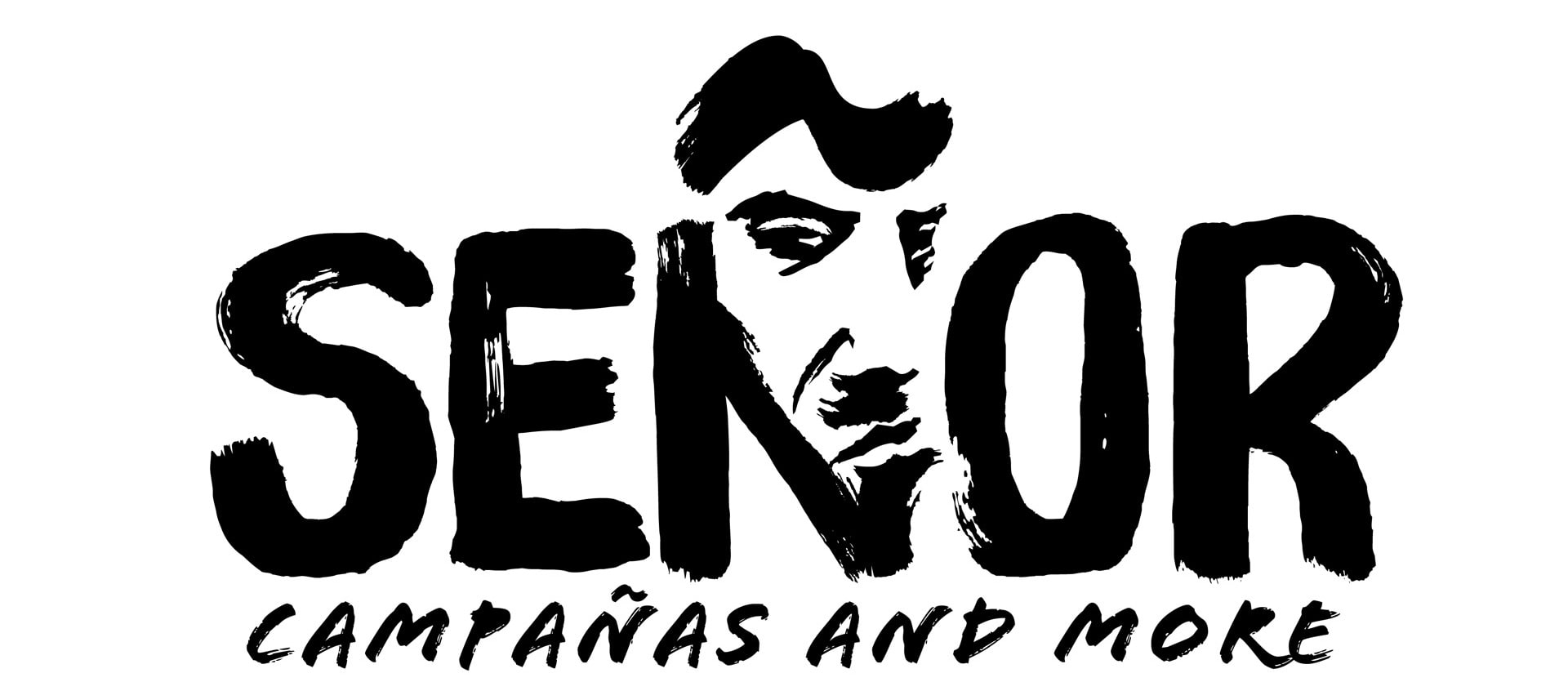 Developing the perfect logo tested our friendship with the illustrator.
CAMPAÑAS AND MORE
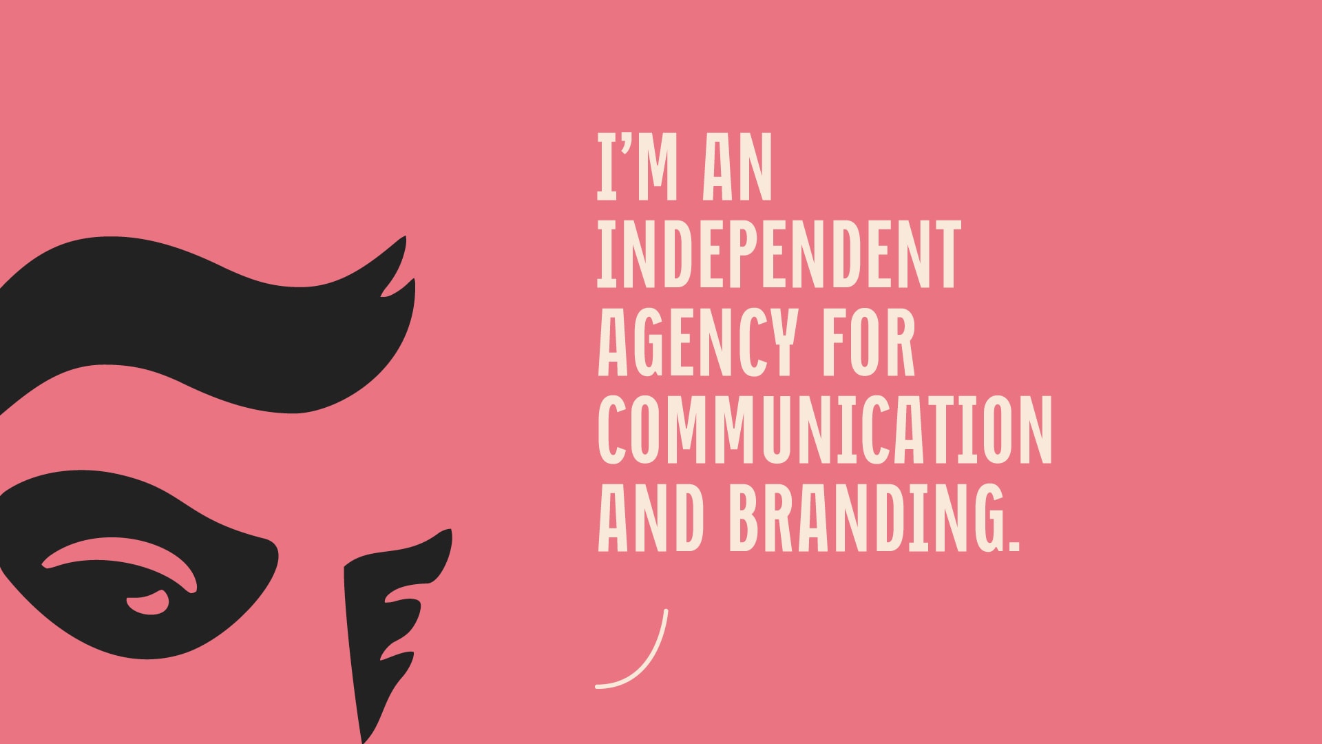
Señor is a creative problem-solver. He helps firms and individuals with marketing communication and branding. Whether it’s a communication platform for a telecom, rebranding of a health-food company or a non-profit project for saving the dolphins, we love to think it over and find solutions that are always new, smart and beyond what’s expected. And so: Señor. Campañas and more.
“You should name the company after me.” - Tilda Swinton
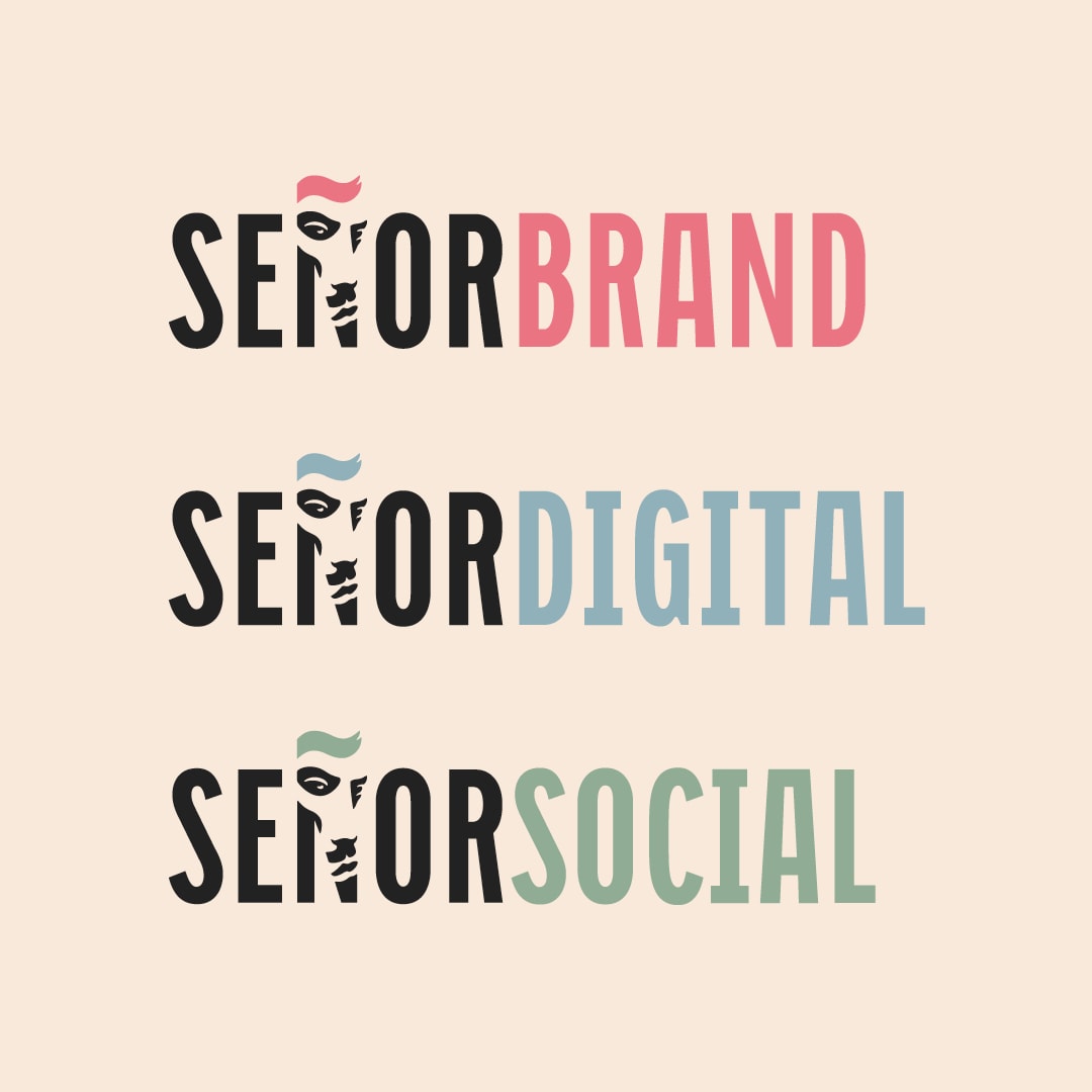
ÑUBIE WITH A CAPITAL Ñ
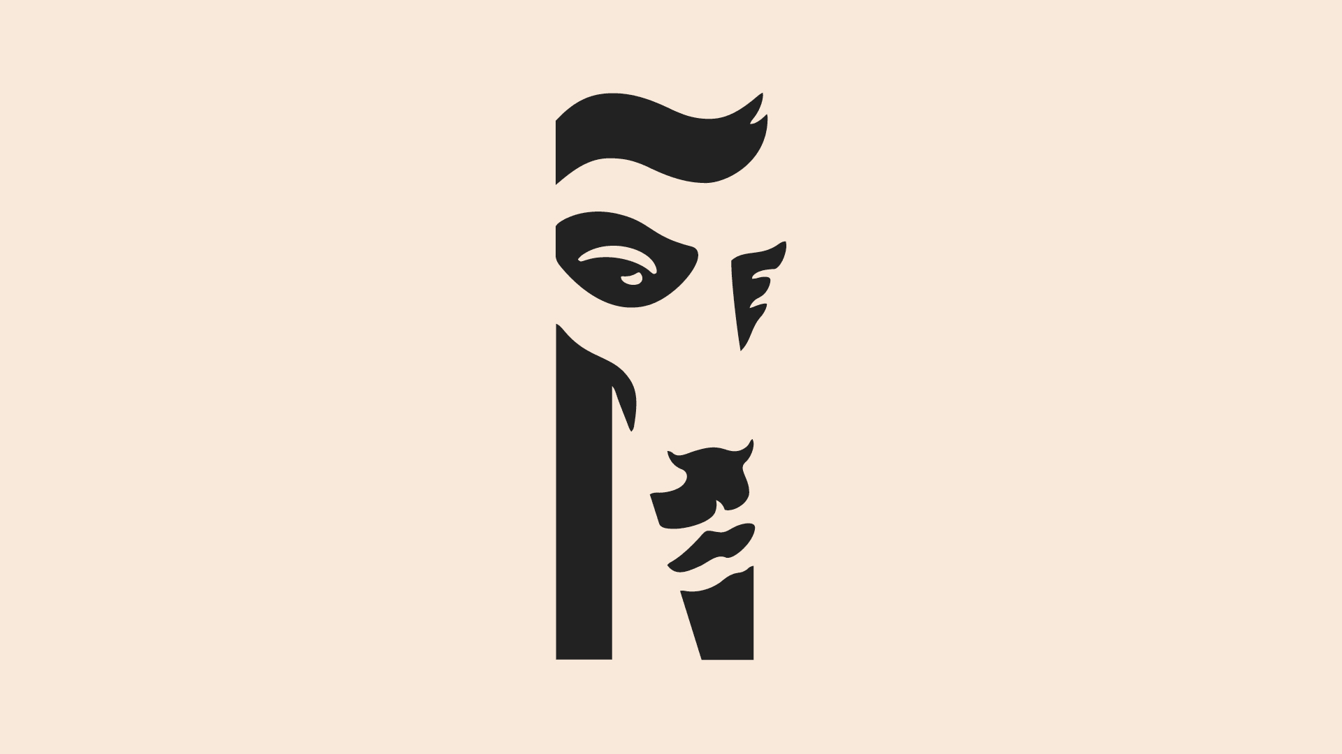
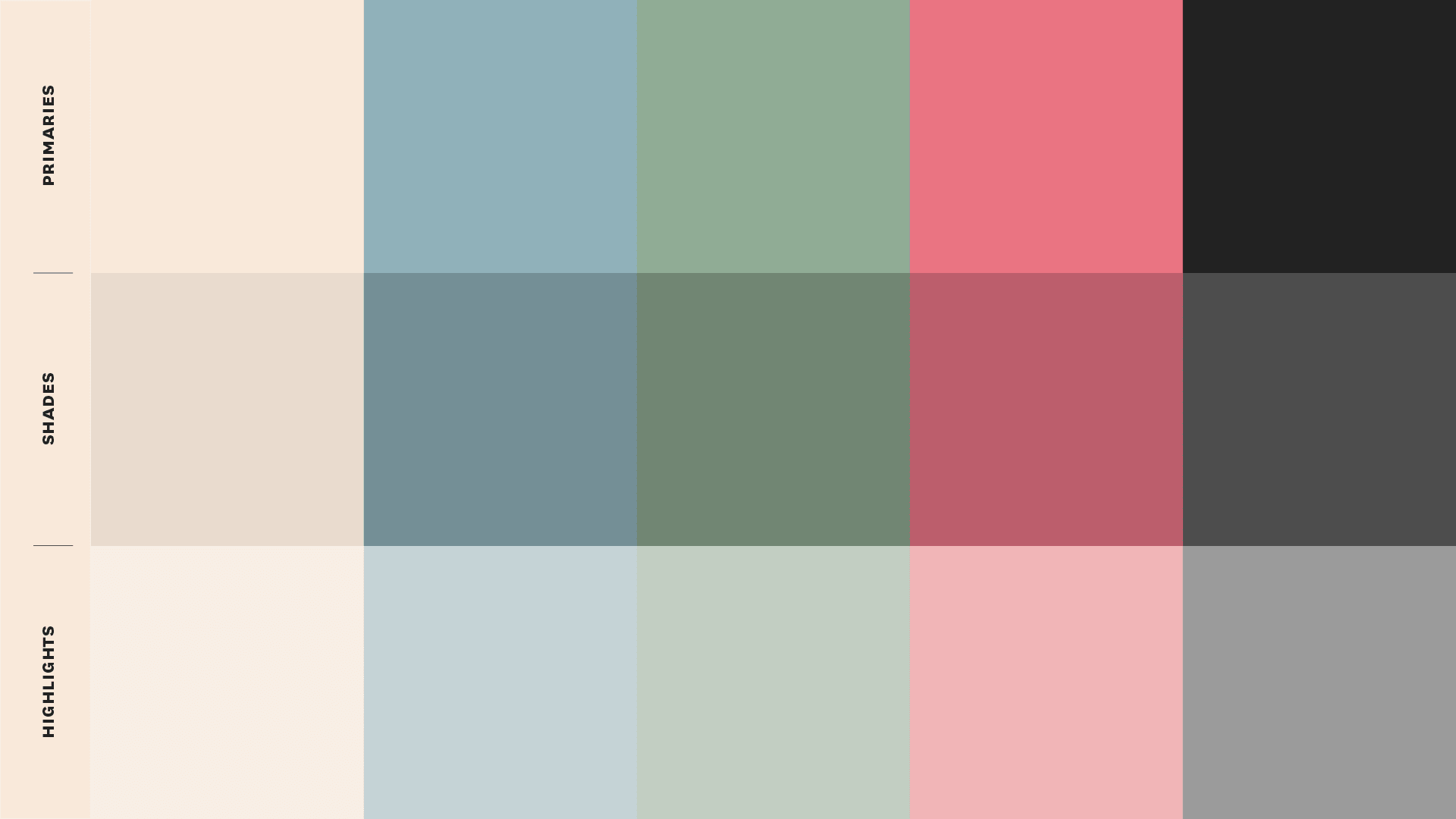
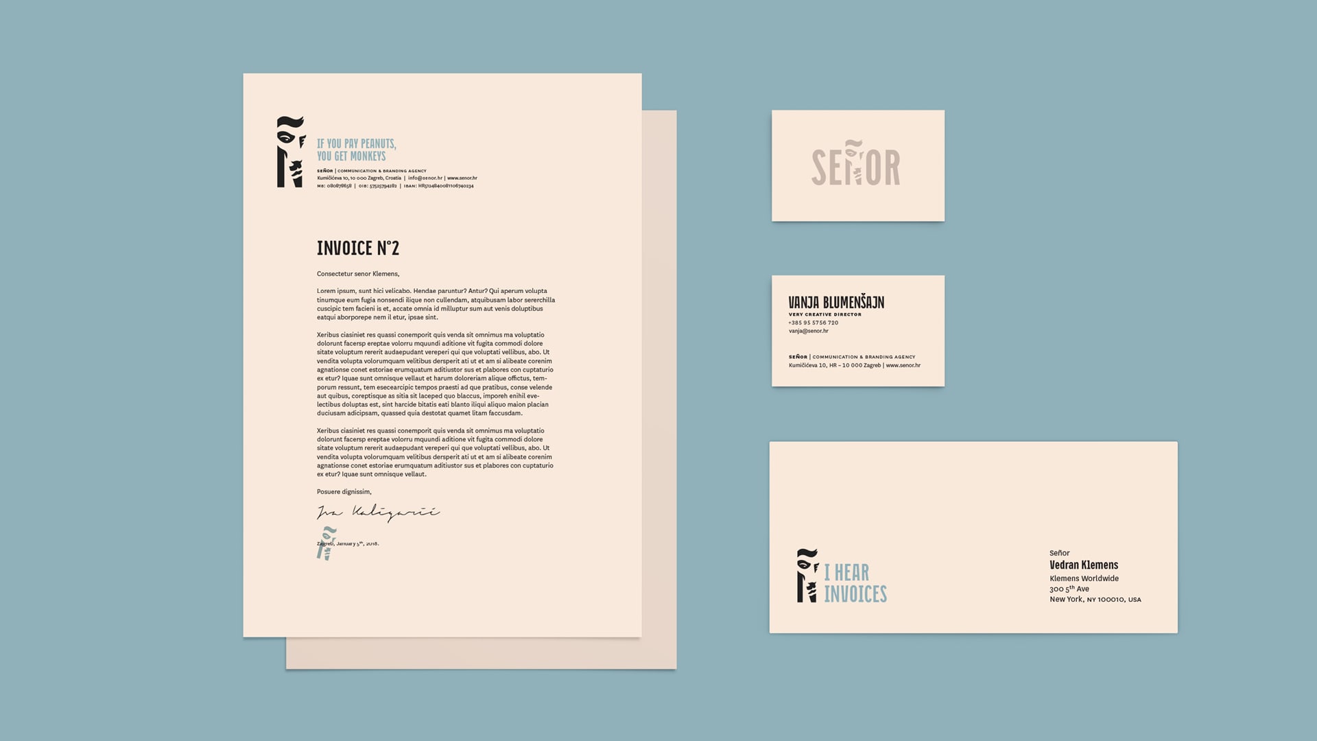
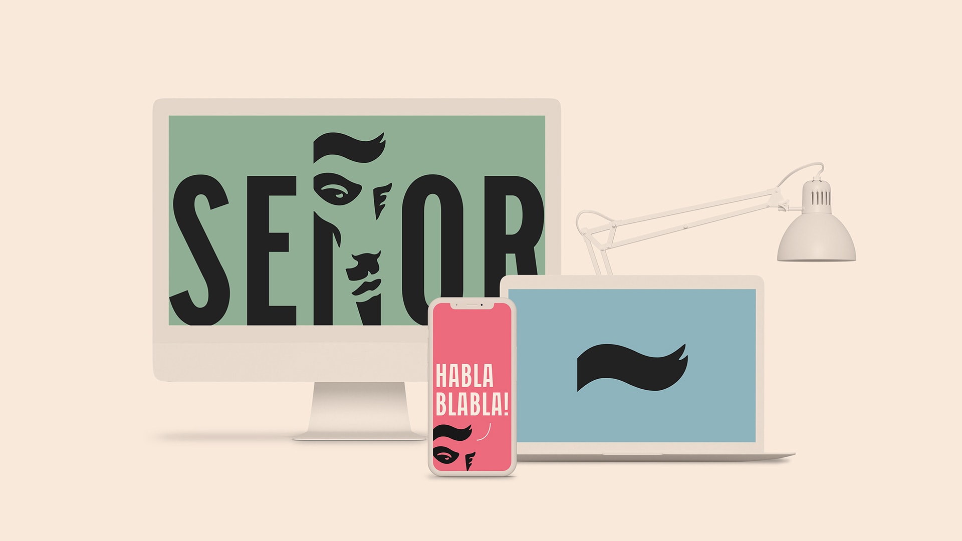
Every solution that Señor signs off on has to be thought-through and executed to perfection. Therefore, the branding couldn’t just be trendy - the colors evoked the timeless golden era of Mad Men and, combined with the typography, created a distinct setup. Still, the star of the branding is the Ñ, which gave the agency a recognizable character and whose wavy curl ~ is the most charming part of the branding. Adding a bit of wit and humor left clients with nothing else to say than: Sí, Señor!

Credits
Señor
Vanja Blumenšajn ~ Very Creative Director, Copywriter | Vedran Klemens ~ Art Director, Designer | Iva Kaligarić ~ Strategic Director