Remember those childhood summers when we used to rush out of the house to catch the ice cream truck, when we weren’t allowed to swim past the buoys or otherwise sharks would bite us right away, and when we couldn’t wait for the afternoon wind so we could run into the big waves over and over again?
BIG FISH, SMALL POND
The gastronomic offer of fine dining and street food in Istria has plenty of quality spots these days. We could say that northwestern Istria features the biggest concentration of top Istrian restaurants, and that’s exactly the region where our client’s food truck sets out on its journey. On their already beaten tracks, alongside us ride many other street food joints that mastered branding and, of course, culinary skills, and are doing it world-class, just like some of the big names on the international burger scene. Lucky us! And so, to stand out in the sea of big players, we decided to do the opposite – go local!
Since this brand was started by native Istrians from Umag who learned the secrets of fine Istrian cuisine from their grandmothers and grandfathers, its identity had to clearly reflect the origins and culture of Istria. It also had to fulfill the tourists’ eternal wish for experiencing a place through the eyes of locals.
STREET FOOD WITH THE PINCH OF NOSTALGIA
It wasn’t all that windy when we held the briefing, but we were still splashed by a wave of nostalgia for summers past by the sea. We were thrown back to those times when children blew bubbles and rode merry-go-rounds, when food had a fuller flavor, the pace was slower and retro trucks were often seen gliding down the streets.
This mobile project is slated to travel around food festivals but also has big plans for growth: a restaurant, a merch shop, its own festival, craft beer… you name it! We called it Poluotok (Croatian for peninsula), after the way Istrians call their region, and gave it the slogan Fast food, slow mood. No matter where you come from, Poluotok will be a place where you can grab good local grub and booze, enjoy low-key events, slow your day down and taste that feeling of a good old summer in Istria.
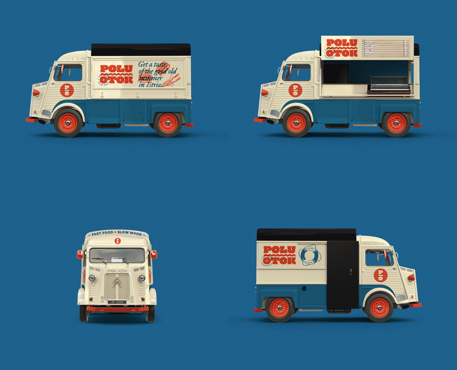
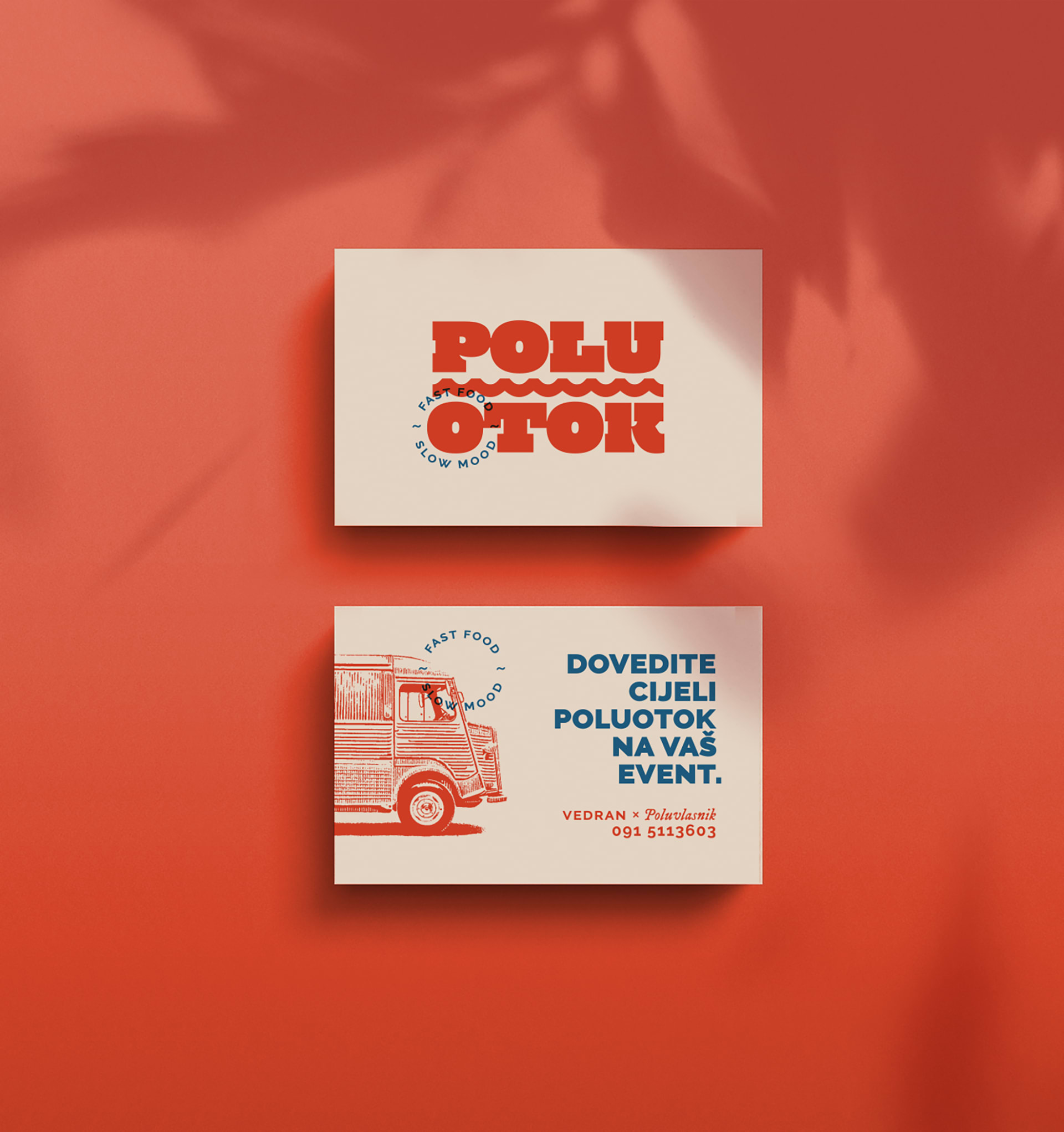
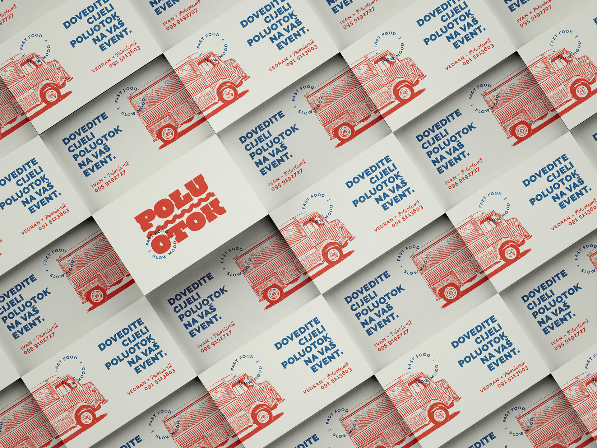
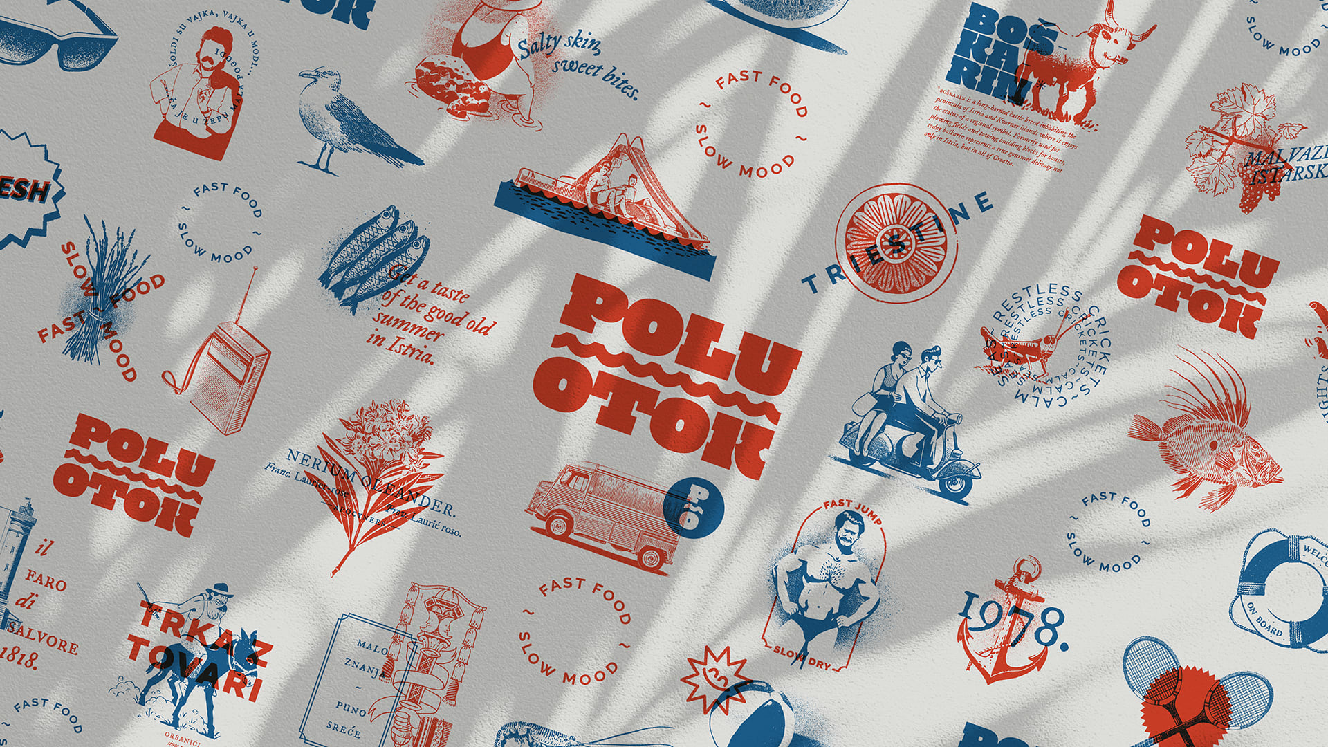
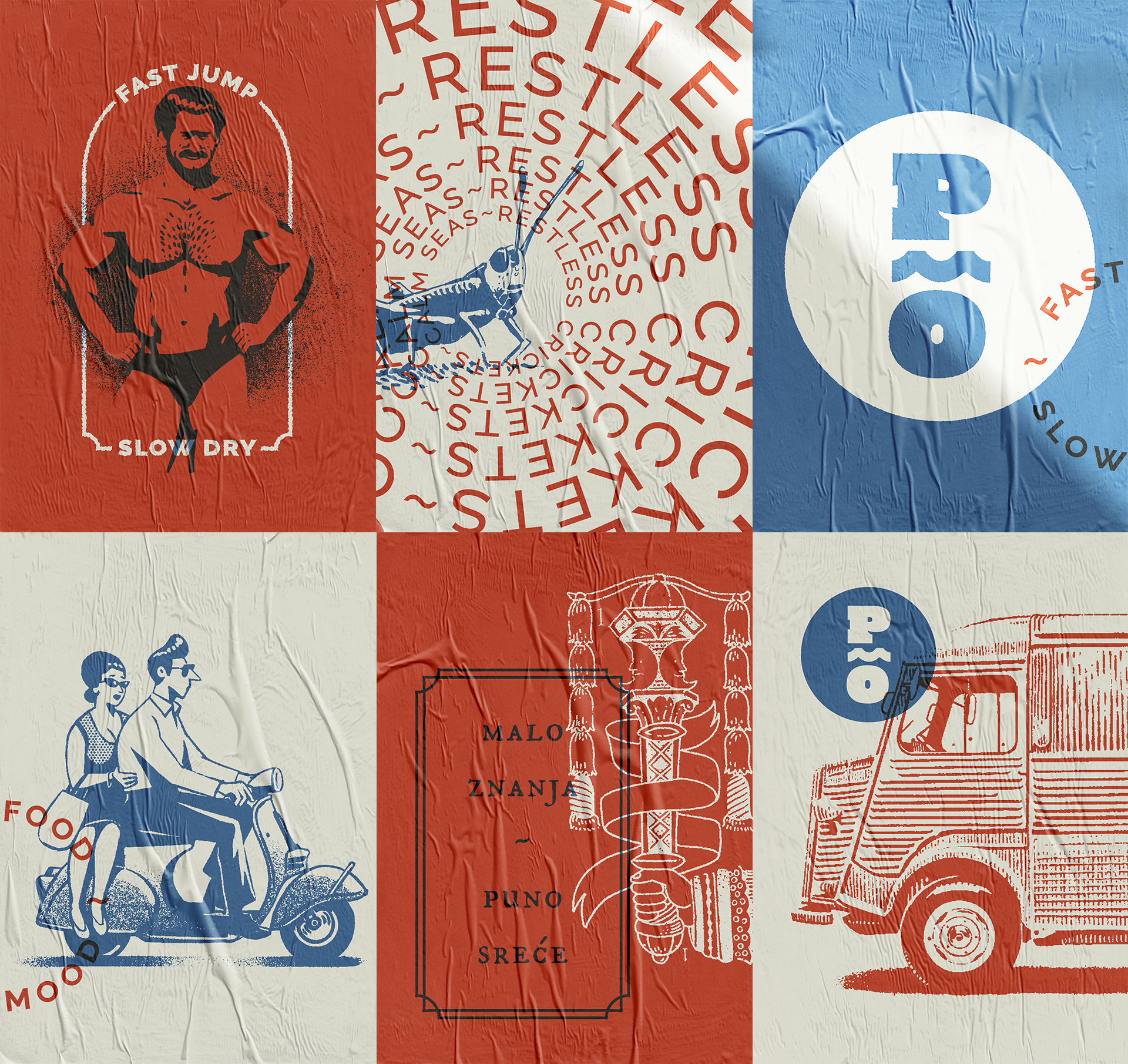
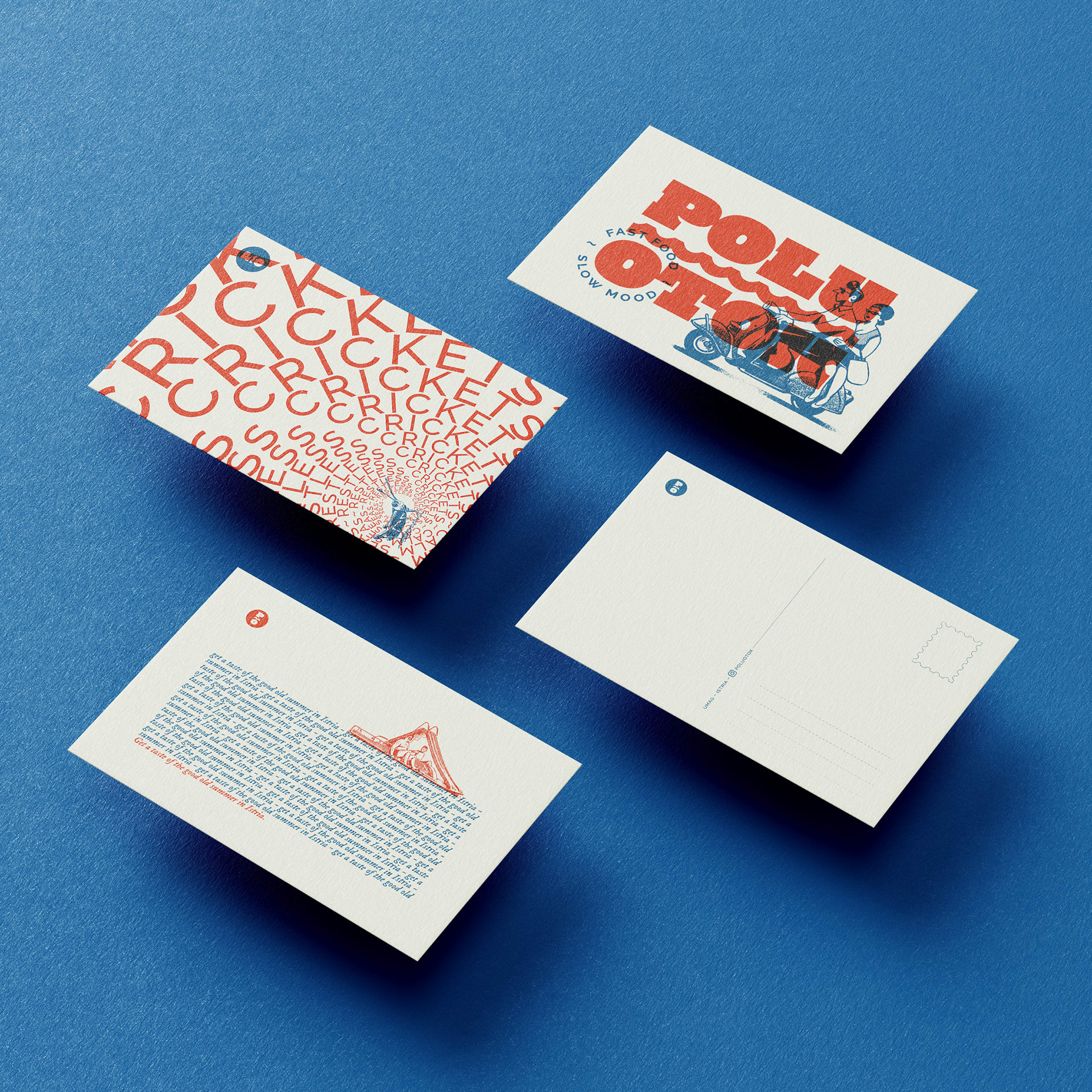
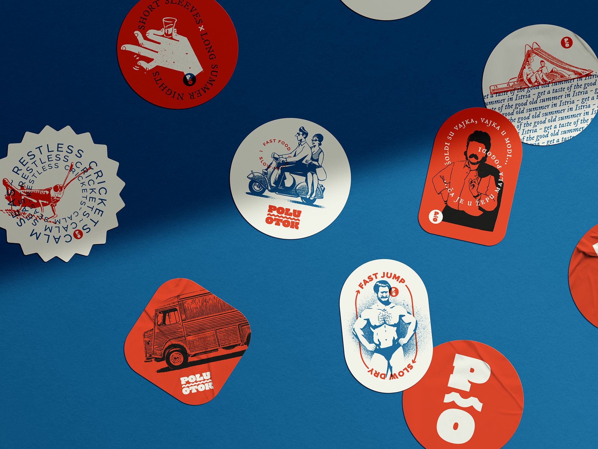
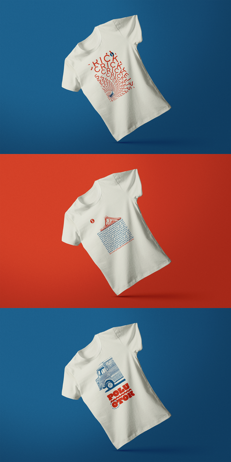
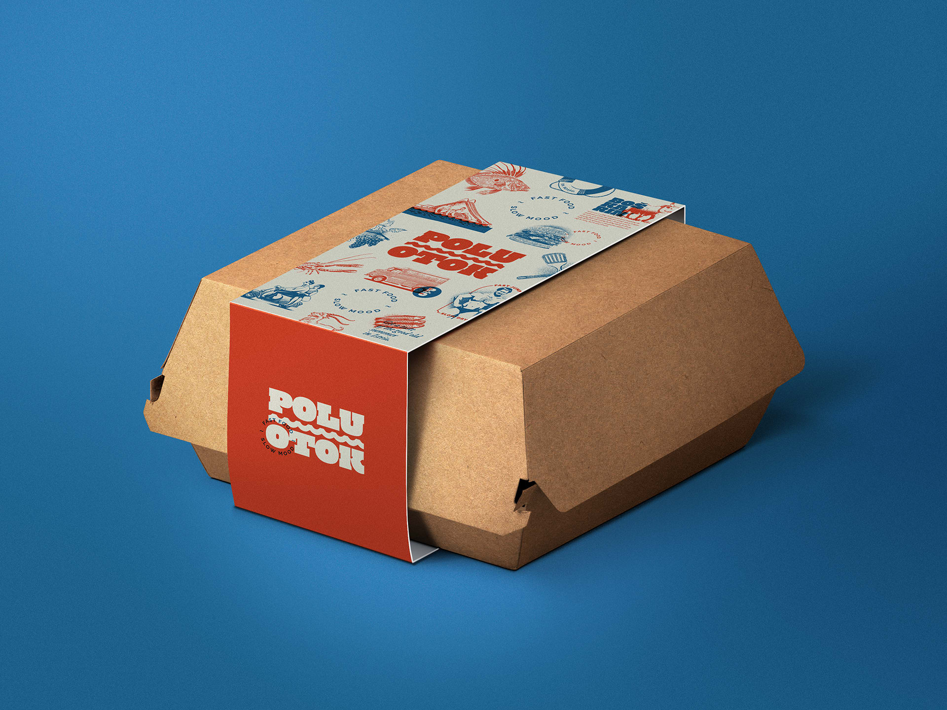
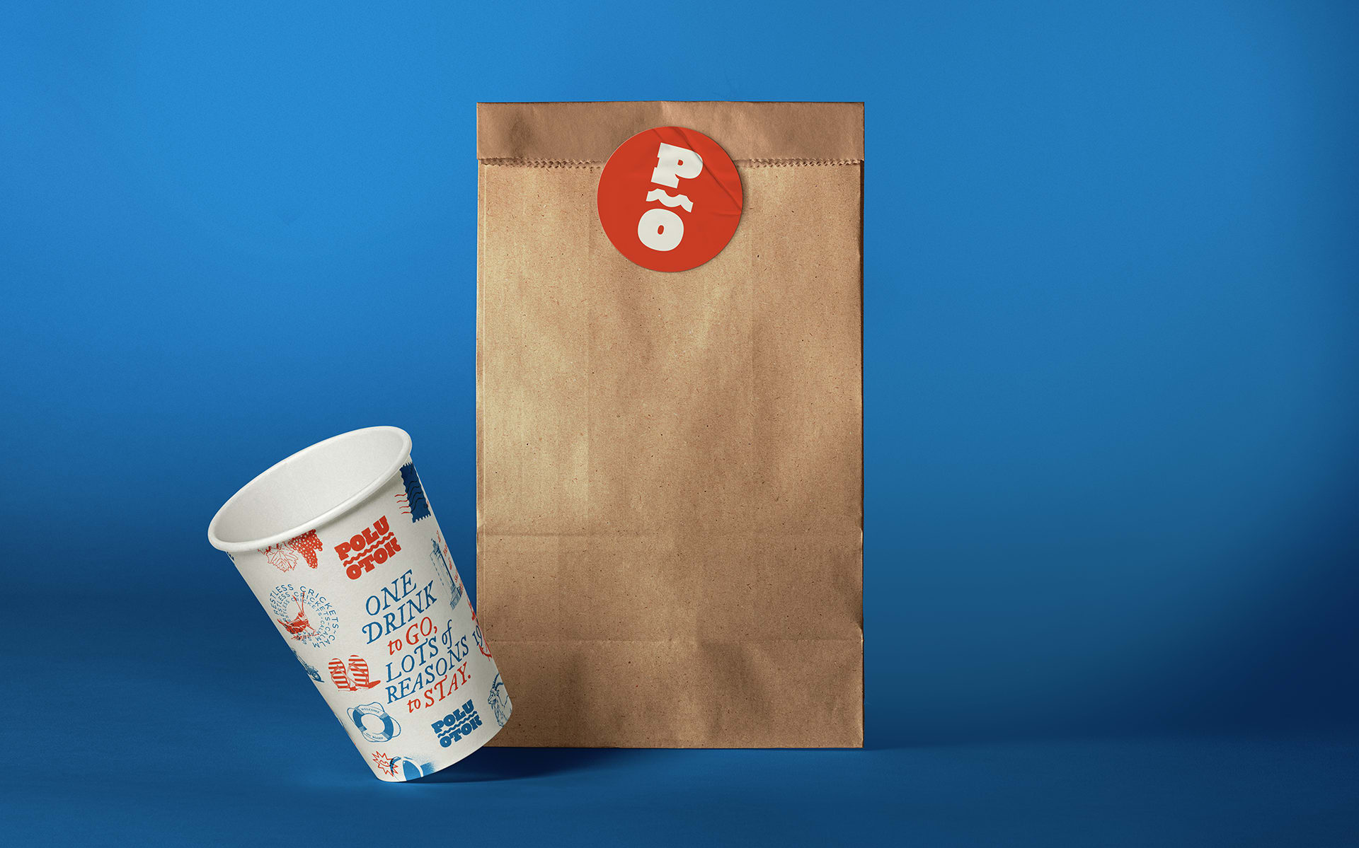
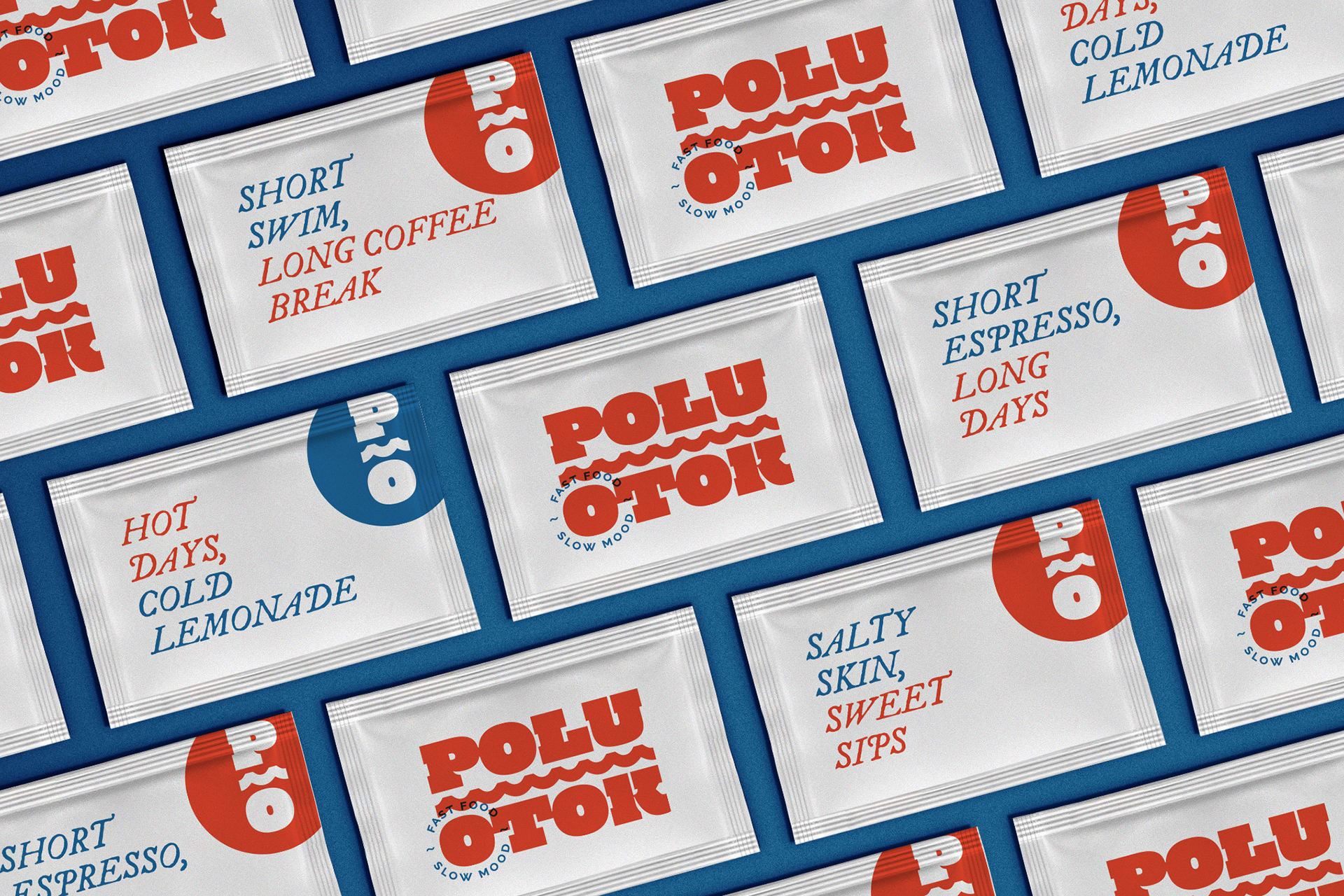
With a pinch of nostalgia in the visual expression, we’re looking back to the symbols of summer that make us enjoy it so much, and which have slow mood as the common denominator. We conveyed the use of contrast in the slogan (fast-slow) and in the name of the brand (mainland-island) also in other materials that present summer associations in contrasting pairs. Take a look at the diverse use of branding that’s going to sweep you off your flip flop-wearing feet, and see you on the Umag shores.
Credits
Señor
Iva Kaligarić ~ Strategic Director | Vanja Blumenšajn ~ Very Creative Director | Irena Golubiček ~ Branding Specialist | Jurica Ćorluka ~ Head of Creative | Lucija Drača ~ Junior Copywriter | Damir Mazinjanin ~ Art Director, Illustrator
Poluotok
Vedran Kaligarić ~ Co-owner
