
Regarding of the upcoming Exhibition of Croatian Design 19/20, Vizkultura presented Señor's works to its readers. So far, they have already reported on the design of the SUN U musician's album, the Cert.hr campaign and the Gloomy Christmas project. Below are a few others: the branding of the event agency After, the packaging of Olivica olive oil, the design of Señor's website and the identity of the oPoP studio!
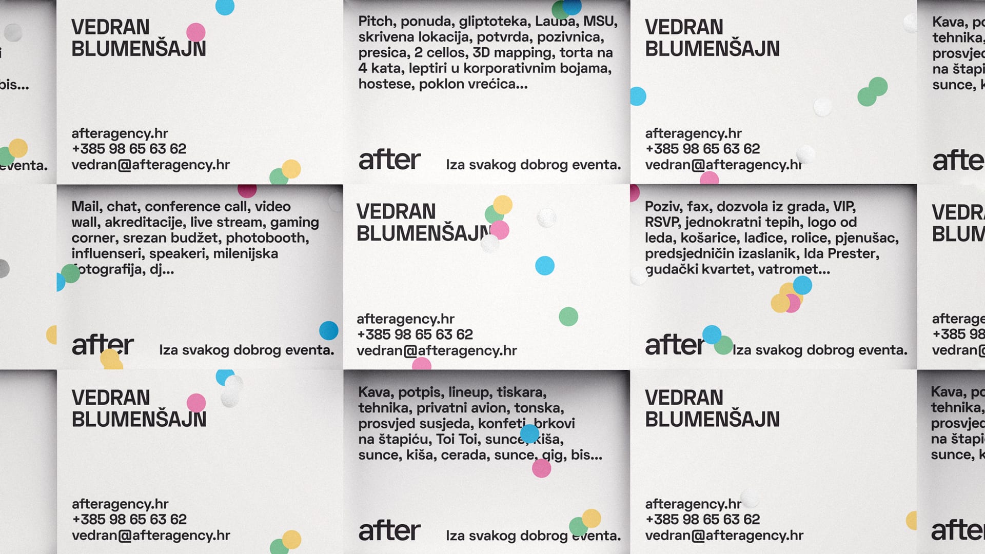
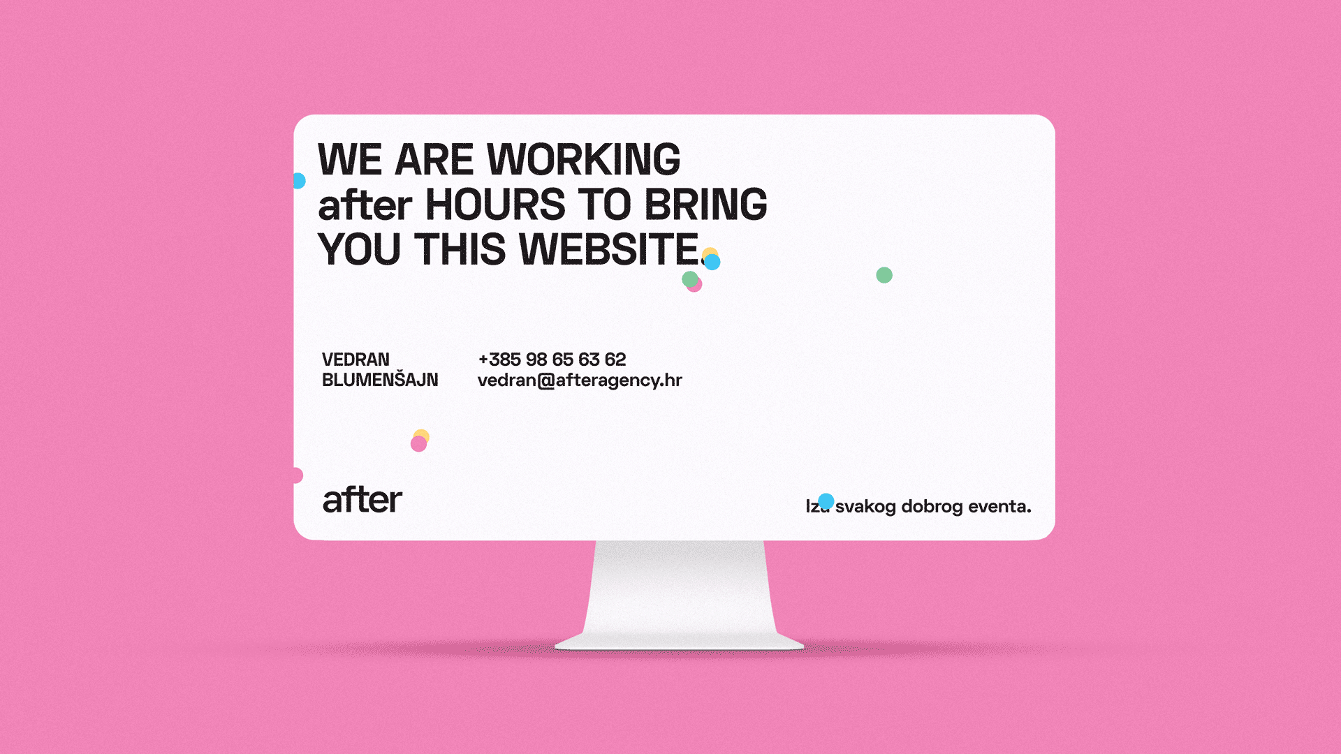
AFTER. BEHIND EVERY GOOD EVENT
What do all good parties have in common? The after-party, obviously. Señor was inspired by this well-known fact when naming and creating slogans. Besides being the chronological conclusion of every great party, after (party) also became a guarantee of success - a partner that is behind every project well done. When you know everything will go through as planned, you can sit back, relax and enjoy the canapés and champagne.
We brightened up the starting position, the minimalist black and white visual identity, with an immortal event prop - confetti, thus making every single piece of material (from business cards and mail signatures to invoices and memorandums) unique. A series of associations thematically linked with unique types of occasions made business cards tell their own tales of (un)predictable requirements that precede events. Don’t worry, when done properly, a party always finishes with a happy en… after! More on the link.

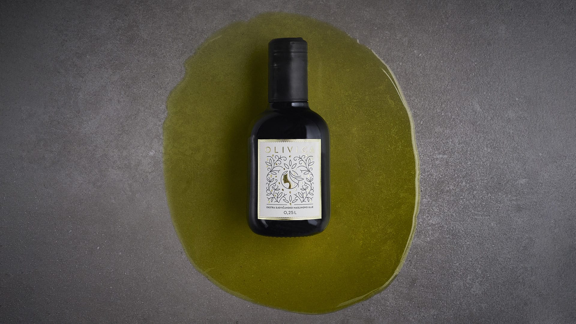
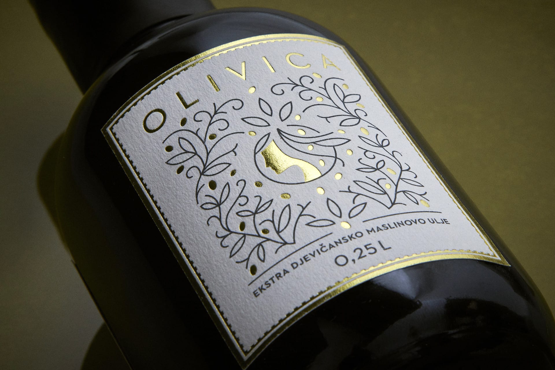
OLIVICA PACKAGING
In the area of Vrbica, Lazinica was picking oblica olives and thus Olivica was born… This is how the story of olive oil begins, where Ica, the Liburnian goddess of water, has been watching over family olive groves since ancient Scardona.
Thus begins the story of olive oil told briefly and clearly - on the label. Because Ica, the Liburnian goddess of water, is worshiped for centuries as the vineyard and olive grove protector in the region, as well as the Vrbica locality where the olive grove is located, the local variety and the family name Lazinica all share the ending -ica, the oil was named Olivica. In addition to the important olives, Ica also served as an inspiration for the design of the label with the addition of gold foil worthy of the goddess among olives, gold-worthy, Skradin oblica. More on the link.
SEÑOR WEB
Señor has come a long way since the initial launch of the quickly stitched together senor.hr so we’ve decided to award him with a proper website for his fifth birthday. And once we decided to take on a mega-project like this, besides wanting to implement every little thing a website like this should have, we’ve come acquainted with a well-known fact that a project like this naturally keeps “dropping” on the list of priorities - so the five-month deadline easily becomes ten and then 15.
We detected two main targets: 1. potential clients and 2. potential colleagues (not excluding the creative industry in which we actively take part in). So, it was clear that we wanted to present ourselves to an audience that doesn’t know (enough) about Señor, but would be willing to click (with us). If we don’t want to talk about ourselves, it was vital that we present our most significant projects and let them do the talking. This crucial decision laid the foundations of our website architecture. We decided to focus most of our attention on presenting our work, so that we could convey the thinking behind the project, show the most important materials, reveal what happened behind the scenes (statements of people involved) and show the results. In short, to present everything that was necessary for you to gain some insight into our process. This seemed particularly important to us; we believe that those who recognize our principles and feel a professional affinity for working this way will have an easier time deciding to team up with us, spare us the exhausting nuisance of pitching and maybe join us in our mission to save advertising.
It isn’t often that in a span of a couple of years an agency wins awards for the best agency in the region, the best campaign of the year, the best packaging in Croatia and the region, the best billboard and a Grand Prix for the best digital campaign.
That’s our comparative advantage, something that cannot be claimed by numerous other agencies and studios. From the start our planning, we had an idea about video content that could represent our visual identity. A couple of brainstormings later, this idea escalated into renting a high-speed camera, a huge studio, a bunch of confetti, pedigree cats and a heat stroke from all the lighting (and the production fee). We’re hoping that the amount of puns (have you stumbled upon our mini Read more campaign?) didn’t stand in the way of our main goal: you getting to know our work and our modus operandi. More on the link.
 Señor loves smart strategies, unconventional ideas and top-notch production packaged as non-spam communication relevant to people and brands. And piña colada!
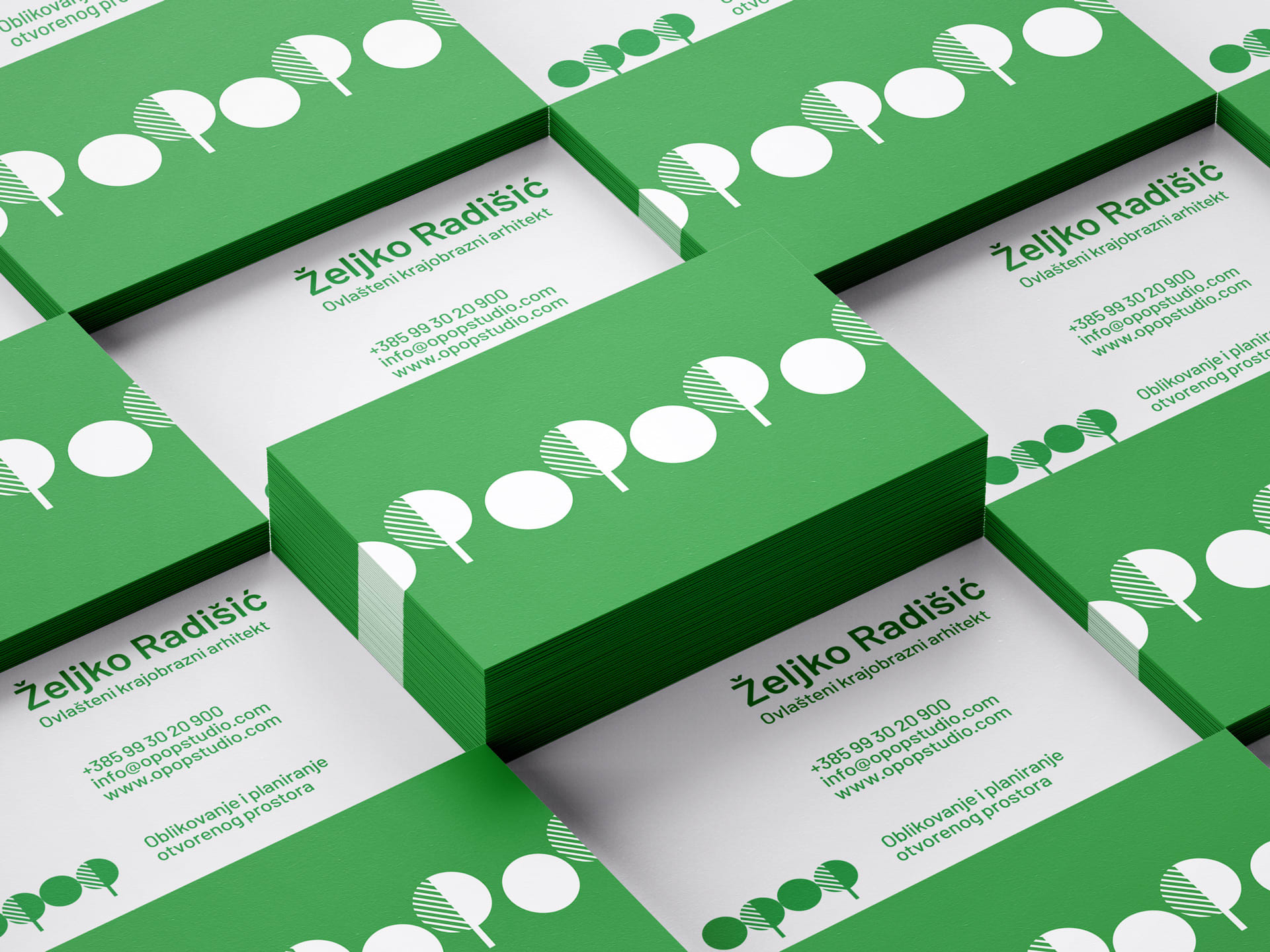
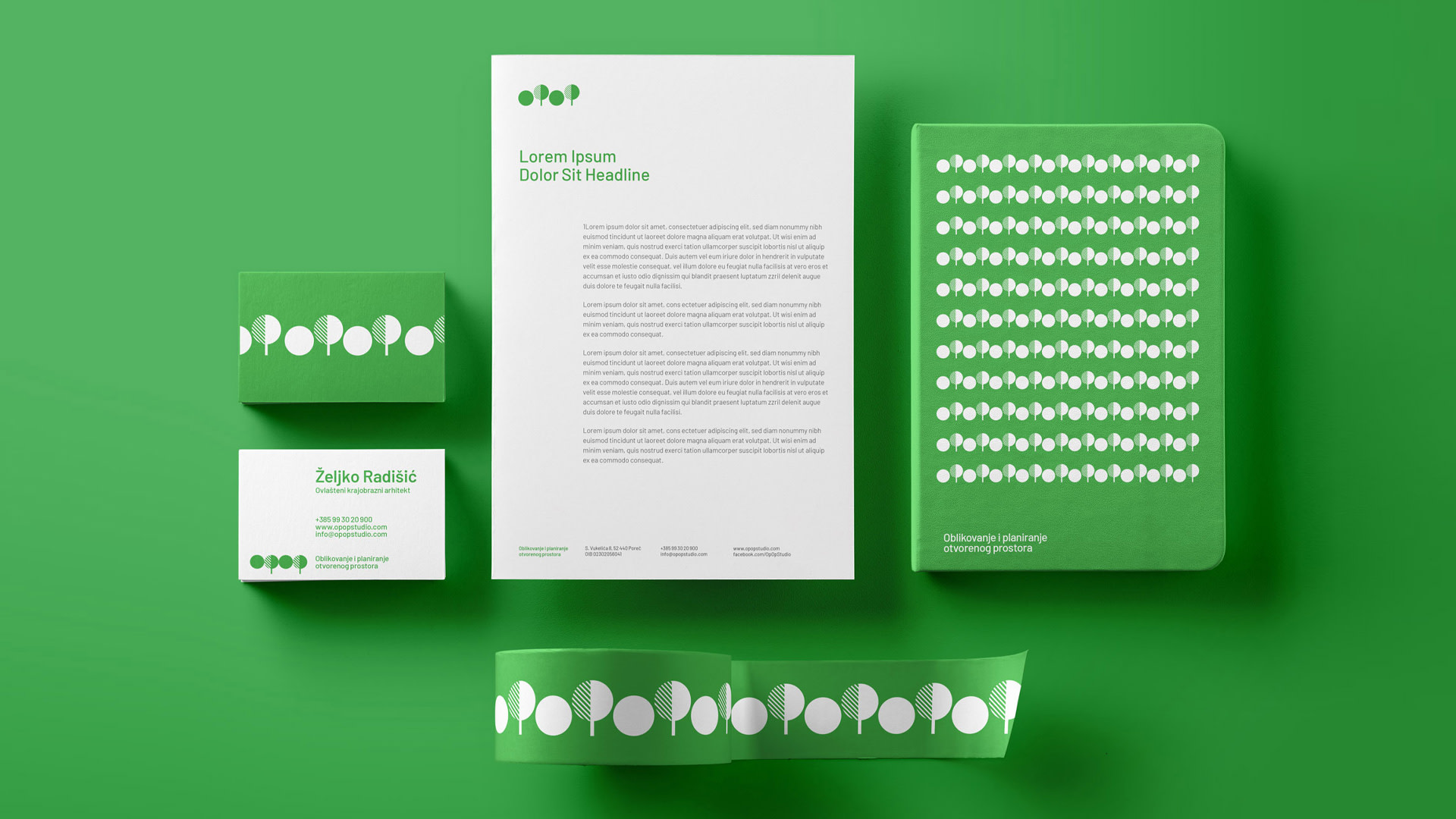
(T)OPOP BRANDING
What do you get when you cross a landscape architect, a few bushes, cool typography and onomatopoeia? This is the question Señor asked while creating a visual identity for a studio specialized in open space design and planning.
Given the descriptor of the studio “Open space design and planning” (in Croatian “Oblikovanje i planiranje otvorenog prostora” - or shorter OPOP), it didn’t take long to look at the letters and recognize a tree and a shrub (oPoP) , the basic elements of landscaping. And on top of that, the movement between the letters o P o P underlined the playfulness of the brand name. Once you become familiar with the principle of the logo and the similarity of horticultural elements and letters, you can type out the logo in any font in your daily correspondence and keep the concept behind the identity. That’s how we came up with the logo - the logo also representing the typography and the illustration elaborated throughout the visual identity. We also wanted to stick to the architectural precision and the creative spirit, so we applied the minimalist flat design to all offline and online materials. More on the link.

The article was originally published on the Vizkultura.hr portal.